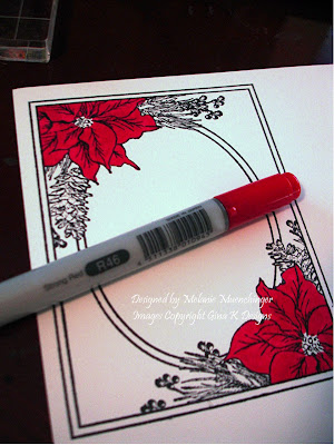
 Color the poinsettias completely with a solid coat of R16 Strong Red (above).
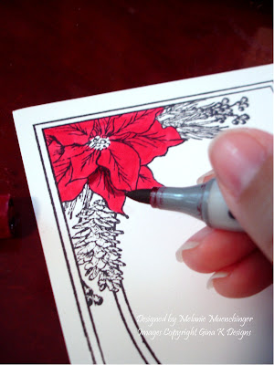 Imagine "the light" coming from "above", and trace along the undersides of each petal with R59 Cardinal where there is one overlapping another, just following the underside of the lines.
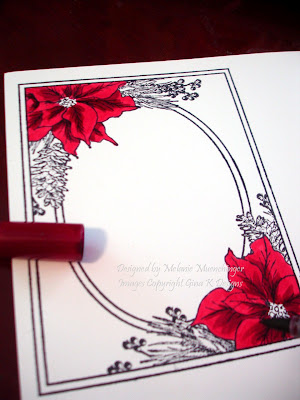 Now trace the veins with Cardinal down the centers of the leaves, working from the middle going outward, and small strokes out from these, again just going over the lines. I love the contrast of these two colors, they provide very dramatic shadows and give lots of dimension. (If you like this look, skip the next step. If you want a more blended look, go to step 3.)
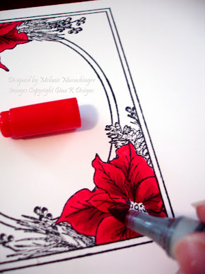 Pick up Strong Red again and go over these areas you did with Cardinal, working in the same direction you made the Cardinal strokes. If more blending is desired, go over the lines/areas in small circles. You'll see how these darker lines blend seamlessly into the Strong Red layer.
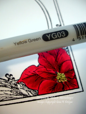 Color in the center with YG03 Yellow Green of other bright, light green.
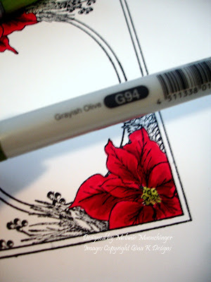 Add a few dots of Greenish Olive or other darker green to the middle and bottom of the center.
That's it! you're done! Trace with a Stardust pen or add Stickles for shimmer if desired.
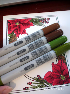 Here are the remaining colors I used for the pine cones and needles. As you can see: I usually only use two shades of a color, and create the other shades i need "in between" by doing tip to tip coloring, (which is picking up the darker color on to the lighter marker and coloring with that, which I'll share this another time) )or as I did in this tutorial just using the lighter color as a blender going over the darker color.
I hope this was helpful! I know you've seen this color combo from me a ton of times with this image, but it's just what goes with stuff I like around my house. ;) To make purple, pink, blue, whatever, just choose a light and dark shade of each and follow the steps above! :)
Stay tuned for a project I am SO excited about using this colored image!! :) Any guesses what I made this time??
Melanie, thank you sooooooooooooo much for this tutorial! I can't wait to get my stamp set and try it out for myself. I may not have all the same copic colors you used but I think I can use what I have. Thanks again!
ReplyDeleteWOW, Melanie, thanks so much for explaining this so detailed. I just finally bought some Copics and I am praticing and your instructions are just beyond helpful!!!!!! THANK YOU!!!! Hugs, Sabrina
ReplyDeleteYa know, I thought I learned to color in grade school, but that's not the case! Thanks for the tips and tutorial!
ReplyDeleteAbsolutely beautiful! Thank you for showing how to do the shading!!!
ReplyDeleteJan Castle
Thanks so much for the detailed coloring tutorial, Melanie! The outcome on yours is absolutely gorgeous! Just got my Festive Frame - I'm going to go give this a try!
ReplyDeleteWow, you did a beautiful job. Thanks for sharing with us.
ReplyDeletesmallcity
Beautiful card. Great tutorial. I am just learning how to color with Copics and this demo was very helpful. I love your work!
ReplyDeleteI know I must totally bore you when I say you are truly amazing. I say it all the time. I am sorry but your creativity just amazes me and I don't have words.....
ReplyDeleteThank you for an easy, clearly written tutorial! Now I just need the Copics.
ReplyDeleteyou are amazing! Thanks for sharing.
ReplyDeleteSandra