I have a post up on the Cardmaker Blog today. I hope you'll check it out!
Showing posts with label Tip. Show all posts
Showing posts with label Tip. Show all posts
Thursday, May 16, 2013


Tuesday, April 3, 2012
Magnolia in a Vase, and Some Info
Good morning! Today I have a magnolia from "Stately Flowers 3"(one of my favorite images in the series!) inside a small bud vase from "Buds and Vases". I just love the mix and match possibilities for all my floral sets with these vases and baskets since they are drawn in the same style and scale! Cardstock is Gina K Pure Luxury Chocolate Brown, Little Boy Blue, White, and Lemon Drop. Die cut is Spellbinders Labels 20.
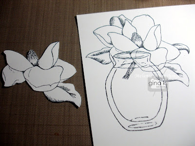
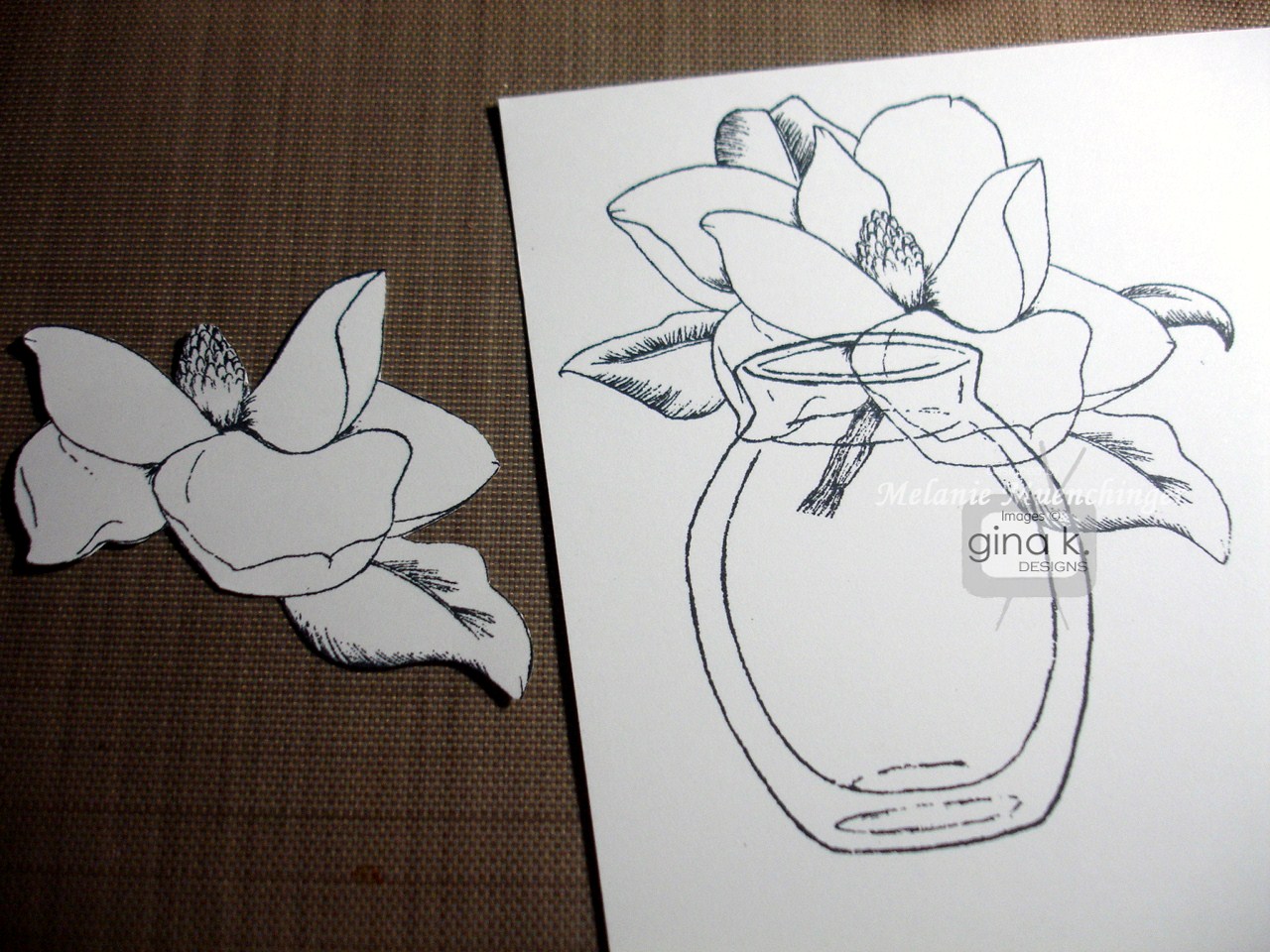
 First stamp the flower and the vase in black on white CS. No need to mask, top where images intersect will be covered. Just stamp a second magnolia and cut out the petals that will overlap the vase in the front, plus a few extra. This will create so much dimension in the final floral image.
 Color the center with Y11 and shade left side with W-3. Use C-3 to create shadows on petals at center and undersides. I just make tiny flicks with the tip. Do the same for the edges of the vases and to suggest water and a shadow underneath. Use a blender to blur lines if edges of gray look too hard to you. that's all you need to fill this clear vase with water!
 Now add YG93 to the part of the leaves that are shaded and leave the areas on the outside and toward the middle with no black hatching marks white. I went ahead and colored on of the leaves that will be covered by the popped up flower, just in case you can see underneath form certain angles, but no need to shade as as you do on the exposed top flower.
 Here it is layered and mounted on the card.
 I added an adhesive pearl on the greeting and embossed both he chocolate and blue layers with Victoria CB folder. TIP: Adhere the brown layer first and then emboss together for a seamless pattern. Hope this card inspires, I adore these two images together!
Before I go, I wanted to address Verna's question from yesterday about loving the flowers, but not really having a use for the state name stamps. I totally get that, Verna, and am sure it has crossed others' minds! (and of course, not all of our GKD fans even live in the US, they are all over the world!) If you look over the sets, however, you will see the state names are really a very small percentage of the total stamps, both by number and square inch of rubber used, here is a breakdown:
 I want to let you all know, if you don’t have any of the Stately sets, that these are some really BIG images! The magnolia, for example, measures 3 3/8” x 2 ½”. That's a big stamp! Your card needs little else to feel complete. Also, I pack these stamps into sets as *tightly as possible* to still allow for cutting. There is very little rubber left. If you compare them to other sets of similar size on the market, these have far more greetings and images. I try not to let a bit of space go to waste to provide the maximum versatility and bang for your buck!
 First stamp the flower and the vase in black on white CS. No need to mask, top where images intersect will be covered. Just stamp a second magnolia and cut out the petals that will overlap the vase in the front, plus a few extra. This will create so much dimension in the final floral image.
 Color the center with Y11 and shade left side with W-3. Use C-3 to create shadows on petals at center and undersides. I just make tiny flicks with the tip. Do the same for the edges of the vases and to suggest water and a shadow underneath. Use a blender to blur lines if edges of gray look too hard to you. that's all you need to fill this clear vase with water!
 Now add YG93 to the part of the leaves that are shaded and leave the areas on the outside and toward the middle with no black hatching marks white. I went ahead and colored on of the leaves that will be covered by the popped up flower, just in case you can see underneath form certain angles, but no need to shade as as you do on the exposed top flower.
 Here it is layered and mounted on the card.
 I added an adhesive pearl on the greeting and embossed both he chocolate and blue layers with Victoria CB folder. TIP: Adhere the brown layer first and then emboss together for a seamless pattern. Hope this card inspires, I adore these two images together!
Before I go, I wanted to address Verna's question from yesterday about loving the flowers, but not really having a use for the state name stamps. I totally get that, Verna, and am sure it has crossed others' minds! (and of course, not all of our GKD fans even live in the US, they are all over the world!) If you look over the sets, however, you will see the state names are really a very small percentage of the total stamps, both by number and square inch of rubber used, here is a breakdown:
Stately Flowers 1-20 stamps: 8 flowers, 1 design element, 4 sentiments, 4 flower names, 4 state names
Stately Flowers 2- 18 stamps: 6 flowers, 5 sentiments, 3 flower names, 4 state names
Stately Flowers 3- 17 stamps: 6 flowers, 3 sentiments, 3 flower names, 4 state names
(If you are worried there is a trend that each set has less than the last, the images just got bigger. And I am happy to report the next Stately set to come out has even more images and greetings than the last few, plus some "winged things" to go with, know you will love! Stay tuned!) I want to let you all know, if you don’t have any of the Stately sets, that these are some really BIG images! The magnolia, for example, measures 3 3/8” x 2 ½”. That's a big stamp! Your card needs little else to feel complete. Also, I pack these stamps into sets as *tightly as possible* to still allow for cutting. There is very little rubber left. If you compare them to other sets of similar size on the market, these have far more greetings and images. I try not to let a bit of space go to waste to provide the maximum versatility and bang for your buck!
I'll admit, I've bought many a set in the past that has a a few images which never see ink as well as the extreme that I got something for just ONE image ( I know, I know!!), but used that one stamp so much that I felt it was well worth it! I hope these flowers would make you feel the same. They are terrific for patterns and colored focal points, and thought carefully about which flowers I put in each set together, to give you a lot of different looks and hopefully at least one flower that really makes your heart skip a beat. You can probably guess from the amount of use each gets on my blog which ones are m personal favorites! ;) And while I have not yet used the state and flower names myself, I am a lover of "words" and enjoy knowing the names of things. On certain designs, particularly vintage ones, having the name and state gives it very botanical feel, lie it's is from an old book or seed catalog.
Finally all these sets coordinate with so many of my other florals, as I've shown the past two days. Baskets are next! :)
Having said that, here are some ideas for those state names (or any stamps in a set that you can't see inking up) if you don't plan to use them... ;)
- Offer state stamp name as a blog candy or pay it forward
- Know someone in that state? Send them the stamp as a surprise! Even if they aren’t a stamper, they would probably get a lot of use out of that one word for other items.
- Post in a online stamp trade forum, someone might really want just that particular state name!
- Save to use as an adhesive remover! Yes, an un-inked rubber stamps works the same as those adhesive removers you’ve seen for sale. If you have some excess sticky stuff squishing out on your mat, or remove a mat and have a bit of yucky adhesive left over, rub clean stamp over it gently and watch as it peels the offensive stuff off and your cardstock looks good as new! (This does not work if the paper tore off)
- pads under a coaster or a trivet (hee, this last one is a joke! sort of...!)
Hope this helps you in making decision whether or not to purchase and what to do with any extra "unwanted" stamps! (Find it a little home, stamps need love, too!!) :) I really need to go back to doing tip sheets for all my sets. Let me know if that is something you want and use! Have a terrific day!!
Tomorrow, bunnies!
Monday, March 12, 2012
Inspiration Hop, Day 2: Wild About You and Blooming with Blessings

The Design Team for Gina K. Designs welcomes you to another fabulous Inspiration Blog Hop! As you hop through their blogs today, make sure to leave a comment on each of them because we will choose a few random comments and those stampers will each win a grab bag of deeply etched, pre-cut Gina K. Designs stamps! To see the full list of winners check the Big News forum at Stamp TV a couple of days after the hops!
 First up, we have the gorgeous safari set "Wild About You" from Theresa Momber. Loving all these animals and silhouettes that so perfectly capture the heart of Africa! Maybe I'll make it there some day, exotic names that roll off the tongue like Kalahari, Congo, and Zanzibar have always captured my imagination, so I'll be making some very inspired sunrises and sunsets with this set in the meantime! TIP: Google "African sunset" to find some gloriously vibrant photos for realistic colors to use and model your cards after!
 This card is inspired by a layout and technique tutorial from my book "A Year of Flowers". The torn reverse masked edge is so appropriate for the rugged landscape. Sponged sunset and grass use Wild Honey, Mustard Seed, Barn Door and Black Soot Distressing Inks. TIP: Instead of using a mask to create a hard horizon line, instead I started sponging at the bottom and made strokes upward over and over to crate the illusion of long blowing grass. Card base and elephant are Pure Luxury Moonlit Fog, elephant is popped up to look like he is coming out of the scene.
 So easy to color this elephant! Stamp in Memento Tuxedo Black on gray cardstock, then add shadows under the ears, legs and trunk with W-1 and W-5 Copics. TIP: Using Theresa's lines and dots in the image as a guide make it easy to create some wrinkles and folds in the ears with quick strokes of your marker or pencil, starting on the edge and working inward toward the head.
 Add a bit of white to the trunk and eyes with an Inkssentials Gel Pen.
 Cut out elephant and snip around the ear and pull out slightly to add more dimension before adhering on pop dots. TIP: stamp elephant's feet planted on grass onto white mat, then put cut elephant over it, this way you aren't cutting out the individual blades of grass.
To accompany this card, please bust out your best rendition of one of the most memorable choruses of the 80's, Toto's "Africa"! Altogether now!
It's gonna take a lot to drag me away from youuuuuu
There's nothing that a hundred men or more could ever doooooooo
I bless the rains down in Aaaaaaaaa-fri-caaaaa
I bless the rains down in Aaaaaaaaa-fri-caaaaa
I bless the rains down in Aaaaaaaaa-fri-caaaaa
Gonna take some time to do the things we never haaaaaaaad
(Nothing like 80's music to get you going on a Monday morning!) ;)
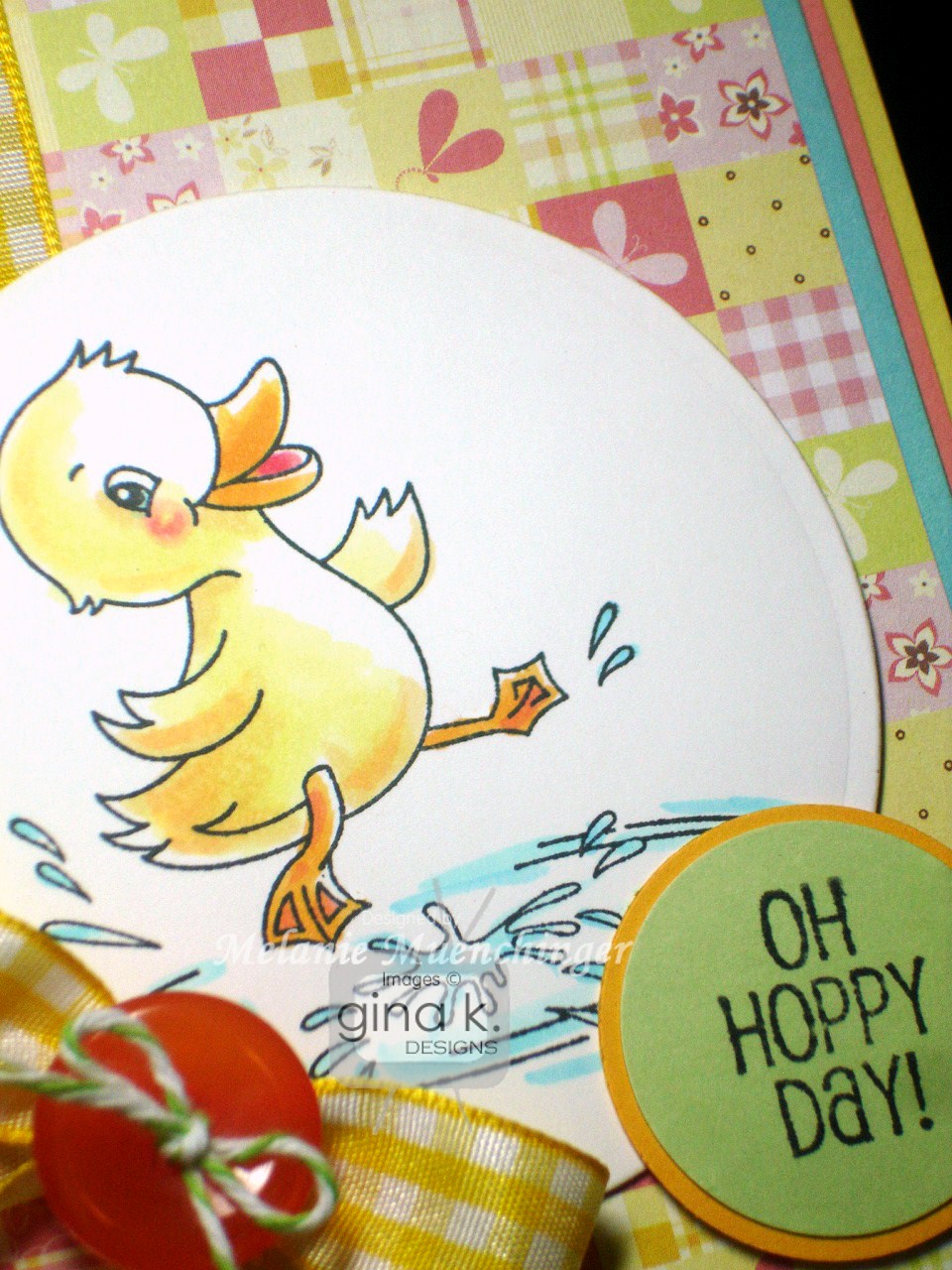
 Next up, We have Rupa Shevde's Blooming with Blessings, a sweet spring set of animals and sayings! I chose this adorable duck and found a perfect match for the Copic colors and cardstocks I decided on in this Pure Luxury Petals and Wings print.
 Here is a closeup of the coloring. Card uses Pure Luxury White, Ocean Mist and Just Peachy for the mats, Lemon Drop for the base, and Wild Dandelion and Creme de Menthe for the tag.
  And here are the colors I used for the duck and water, just a couple shades of each color! This is a much cleaner and easier way to indicate the marker numbers, I'm sure you'll agree. (I saw Jeanne Streiff do this on her blog and thought it looked more professional and easier to read (and faster than stamping again and trying to draw the lines myself.) Thanks, Jeanne!)
 Splish splash!
Now please check out all the amazing designs and inspiration:
- Gina K
- Theresa Momber
- Carolina Buchting
- Cathy Tidwell
- Deb Felts
- Donna Baker
- Emily Giovanni
- Giovana Smith
- Jennie Harper
- Jimmi Mayo
- Lee Murphy
- Lori McAree
- Melanie Muenchinger (you are here, thanks for visiting!)
- Suzanne Dean
- Tina Gilliland
- Vicki Dutcher
Have a terrific day! More inspiration coming tomorrow, see you soon!
Friday, July 1, 2011
"The Vine"

Happy Friday! I hope you have some fun plans for the holiday weekend! My older son Jonathan turns 9 today, so the celebration is in full swing! I wanted to post a card I shared at the party using "The Vine", now available for purchase at Gina K Designs! Cardstock is Pure Luxury Blue Raspberry, Black Onyx and White. I stamped the vine onto Basic Grey Curio DP (these vines and leaves are just such a glorious and easy way to dress up your favorite patterned papers!), colored it in with green and then popped up some stamped morning glories on white colored in with Copics B24 and B05. Greeting is stamped on a Fancy Tags Two die cut stamped and sponged with Peeled Paint and Antique Linen Distressing inks. "Blessings" is from "Say it with Flowers".
Tip: If you want the centered of these flowers colored ink the whole stamp in the color of your choice, but if you want the inside to fglow "white" the way morning glories do, ink up the outer details of the flower only, leaving the inside uncolored, and stamp. Then fill in the outer parts of the petals with color, brushing the tip of the marker towards the center.
More later, I gotta go bake a cake! (By request, Chocolate Chip Gooey Butter Cake, have you had?? mmmmmmm!)
Wednesday, May 18, 2011
Liquid Pearls!
I have been looking forward to trying this color combo with "Branching Out", how do you like? Lemon Drop, Black Onyx, and White (and inked up with Memento London Fog).
 I omitted the bottom portion of the frame for this greeting and accented each side with White Opal Liquid Pearls as well as the flower centers. Oval frame is cut and layered with Classic and Scalloped oval dies.
 Lemon Drop, Black Onyx, and White (and inked up with Memento London Fog).
 I omitted the bottom portion of the frame for this greeting and accented each side with White Opal Liquid Pearls as well as the flower centers. Oval frame is cut and layered with Classic and Scalloped oval dies.
 Have you tried the Liquid Pearls yet? TIP: When I use Liquid Pearls to make drops, as I pull the bottle away, I do a quick circle of my wrist, like I'm making a swirl in Dairy Queen in soft serve!) to pull the drop around so it doens't dry up in a point from pulling the bottle straight away, this pulls that little end around and down so it dries into a nice neat pearl, make sense? try it!
I really WILL start using some other images to accent "Branching Out" besides the "Springtime Silhouettes" I just can't stop, love 'em! Any requests on which sets?? maybe I need some suggestions from you to jump start me! ;)
Monday, May 16, 2011
Omission, Times Two!
Hello!! As many of you know, one of my favorite techniques is omission, which allows you a lot of creative control with your images by inking up only the parts you want! Here it is two ways, I used a marker to make a dashed instead of a solid line on my "Branching Out" frame, using the brush tip and just skipping along the border very quickly, then huffing before stamping...
 and then I decided to let the little bird in Gina's "Springtime Silhouettes" fly away by inking up the cage only without the bird, be free!! :) I accented the branches and popped up stamped and cut flowers with White Opal Liquid Pearls. TIP: Snip in between the petals and curl them out with your fingers to add more dimension.
 I used my own birds from the "Branching Out" set to perch on one of her greetings (with this greeting it's like one let the other out LOL!)

 and then I decided to let the little bird in Gina's "Springtime Silhouettes" fly away by inking up the cage only without the bird, be free!! :) I accented the branches and popped up stamped and cut flowers with White Opal Liquid Pearls. TIP: Snip in between the petals and curl them out with your fingers to add more dimension.
 I used my own birds from the "Branching Out" set to perch on one of her greetings (with this greeting it's like one let the other out LOL!)
And finally a tip on betting your birds to perch properly: use a grid line block and center the image on where there little feet would be (body meets tail) over the cross hairs. Then line up the horizontal line on your block with where you want it sitting, easy peasy!
Have an amazing day!
Friday, February 25, 2011
Color Spotlight #13
Happy Friday! Forgive me for not posting my tip sheet and a few other things I promised yet, but we've been so sick here and I missed the last few challenges so I pushed this one to the top of my list!
 Pure Luxury Creme de Menthe, Red Hot and Lemon Drop! These colors inspired a sweet Spring card with just a little heat!
 I embossed the Red Hot with the Cuttlebug Flourished Frame folder and then die cut a Labels Eight from White to stamp my "Basket Blessings" sentiment on. (I don"t know anyone getting married now but I just HAD to include a bridal greeting in this springy set!) I sponged a bit of pale yellow and green inks (which I also used to stamp the daffodils for a subtle repeat of my popped up flowers) onto the label before removing my die. Popped up flowers are colored with Copics
 Pure Luxury Creme de Menthe, Red Hot and Lemon Drop! These colors inspired a sweet Spring card with just a little heat!
 I embossed the Red Hot with the Cuttlebug Flourished Frame folder and then die cut a Labels Eight from White to stamp my "Basket Blessings" sentiment on. (I don"t know anyone getting married now but I just HAD to include a bridal greeting in this springy set!) I sponged a bit of pale yellow and green inks (which I also used to stamp the daffodils for a subtle repeat of my popped up flowers) onto the label before removing my die. Popped up flowers are colored with Copics
TIP: To create some greenery from the "Basket Blessings" set, stamp the daffodils from the set in either size and color them green. Then snip each flower into 5-6 pieces and layer them under the flowers, leaves from flowers, fun and easy! :)
I added some little adhesive rhinestone bling trails after popping the flowers up. Don't forget to stamp up the inside of you card and your envelope with those pretty flowers!
Hope you play along, you could win new stamps! Be sure to use the tag STVCSP13 when you upload your new creation using this beautiful color combo to the STV gallery!
Have a terrific weekend, come back and visit for more basket stuff!
Monday, February 21, 2011
Bunny Blessings
I am still so happy with how this illustration turned out, they really took on a life of their own, one with a shy smile and the other's stifling a laugh, I just love when a drawing surprises me like that! Although I love the "giggle" sentiment from "Basket Blessings" intended for it, I really wanted to make the image the focus of the card so I left it greetingless.
 Bunnies are stamped onto White Pure luxury and die cut with labels 4. Everyone loves white rabbits, so you can keep your coloring super simple by taking a light gray like c-1 or C-2 or a very pale Copic pastel that has a light blue or purple tint depending on what colors are in your DP you use with it, and just trace around the edges. Add a hint of pink to the ears and that's it! I used two prints from the Basic Grey Olivia pack, making sure to have a few of the whimsical bunnies in the print showing around the label. Cardstock is Innocent Pink and Ocean Mist. This would be sweet Easter card, but also a fun any time "friendship" card.
TIP: Behind this busy fantasy print there is a large dotted print, crop the mat through the middle of the circles on each side to reveal this inverted scallop around the edge, isn't that a fun look, like I did some pretty row of bling all the way around? OR, crop it just outside the circle rows and make the mat that goes over it small enough to cover the inside of the circle for a row of scallops around the edge. If you don't want to lose a lot of that pattern underneath, use your Nestabilities to cut out a shape to use later, the hole will be covered with the mat you place over it. Love saving time and paper this way, use your stuff and use your scraps!
 Bunnies are stamped onto White Pure luxury and die cut with labels 4. Everyone loves white rabbits, so you can keep your coloring super simple by taking a light gray like c-1 or C-2 or a very pale Copic pastel that has a light blue or purple tint depending on what colors are in your DP you use with it, and just trace around the edges. Add a hint of pink to the ears and that's it! I used two prints from the Basic Grey Olivia pack, making sure to have a few of the whimsical bunnies in the print showing around the label. Cardstock is Innocent Pink and Ocean Mist. This would be sweet Easter card, but also a fun any time "friendship" card.
TIP: Behind this busy fantasy print there is a large dotted print, crop the mat through the middle of the circles on each side to reveal this inverted scallop around the edge, isn't that a fun look, like I did some pretty row of bling all the way around? OR, crop it just outside the circle rows and make the mat that goes over it small enough to cover the inside of the circle for a row of scallops around the edge. If you don't want to lose a lot of that pattern underneath, use your Nestabilities to cut out a shape to use later, the hole will be covered with the mat you place over it. Love saving time and paper this way, use your stuff and use your scraps!
Thanks for praying for Brenner, will get an update on whether he is coming home today or not soon!
I am feeling so much better today! Finally! Yesterday was really achy and concerned I might have been getting the flu, but I slept great for the first time in weeks and am about to head out for some fun with my kids on their day off! Be back soon, I have a lot to catch up on here!
Wednesday, December 8, 2010
Mugs and Kisses Inspiration: Double Time
Good morning! I have a few cuppas to get you going!:) This first sample uses the same Cosmo Cricket Jolly by Golly print piecing on the mug from yesterday but with very different colors and layout. The brown and ivory on this first card in the Basic Gray Jovial print and stitched ribbon and removing the blue layer takes it from crisp and cool to warm and homey! Base is Pure Luxury Red Hot.
 Tip: When you are you going to die cut large shapes from cardstock, instead of using the smallest scraps you have to fit the die, center the die into a mat sized to fit a card, this way, you cut once but have two pieces you can use, a focal point AND a pretty frame for another card. The Snowflakes embossed layer worked like a two-for-one!
  SO here is the oval cut out from the mat above, I sponged with with Antique Linen and Vintage Photo. I love the Cosmo Cricket print on this cup! The ornament layer behind is Basic Grey Jovial again, some of the prints in these two packs are really terrific together! I also used my Scor-Bug to pierce a row of dots above and below the DP, this is a great way to add a qucik detial to cardsto make them fancier ( no one has to know how quick it goes! shhh)
 Last, I snapped this pic a couple months ago when I was out for coffee with a friend at Thunderbird's in Austin, I knew it would be a sweet treat to add to a post after "Mugs and Kisses" was released! Isn't that gorgeous, have you ever seen that done before?! Well, it was new to me, a very talented barista* makes coffee a piece of art, almost too pretty to drink! (But of course, I did, honey nut latte, yummo!)
 Tip: When you are you going to die cut large shapes from cardstock, instead of using the smallest scraps you have to fit the die, center the die into a mat sized to fit a card, this way, you cut once but have two pieces you can use, a focal point AND a pretty frame for another card. The Snowflakes embossed layer worked like a two-for-one!
  SO here is the oval cut out from the mat above, I sponged with with Antique Linen and Vintage Photo. I love the Cosmo Cricket print on this cup! The ornament layer behind is Basic Grey Jovial again, some of the prints in these two packs are really terrific together! I also used my Scor-Bug to pierce a row of dots above and below the DP, this is a great way to add a qucik detial to cardsto make them fancier ( no one has to know how quick it goes! shhh)
 Last, I snapped this pic a couple months ago when I was out for coffee with a friend at Thunderbird's in Austin, I knew it would be a sweet treat to add to a post after "Mugs and Kisses" was released! Isn't that gorgeous, have you ever seen that done before?! Well, it was new to me, a very talented barista* makes coffee a piece of art, almost too pretty to drink! (But of course, I did, honey nut latte, yummo!)
 Have a glorious day, stay warm!!
Coming up, a guest designer blast from the past!
*wonder what that gy could do with ink?? It's like the shaving cream technique in a cup! ;)
Monday, August 31, 2009
Big Brother
 Here is a little two piece (well, three piece if you count the hat from "Just So Sporty"!) set I made using "Wee Tees" and some solid Basic Grey DP. If you stamp the onesie image onto two pieces of paper and then draw a line through the middle of one (here the Pure Luxury Ivory) you can create little tops and bottoms from the image, which is a fun (and sporty!) way to change up the onesie! The outfit is made to look like something his little sister might wear. I paper pieced the middle of the ivory section onto the orange DP so the sleeves would be burnt orange as well.
 I made this card for the son of some friends of ours (UT alums) who at age 3 recently became a proud big brother. The little star on the shirt and cap is also from "Just So Sporty" and all greetings on this card are from "Wee Tees".
I used my Scor-Bug to create the stitched borders and Square Scalloped nestabilitie for the mat. just a bit of shadowing with a pale gray marker will give your cut out images a lot of dimesnion.
Happy Monday! Two tip sheets this week plus TWO guest design spots, get ready! :)
Saturday, August 8, 2009
Prepping "Inspiration Mosaic" Tutorial: Part 1
I'm going to be sharing several posts that have pics of how to use "Inspiration Mosaic" step by step. I am breaking down these "getting started" tutorials so there aren't 20 photos in one post!
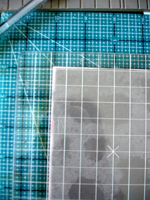
This first pic shows what the mosaic grid looks like adhered to the 6x6 acrylic gridline block. (First I did a superclose trim with my Tim Holz scissors) I have it centered two squares over on each side with the top edge of my image (not the top of the rubber!) lining up with the gridline on my block, make sure both corners meet the line and it WILL be lined up! It doesn't quite meet one of the lines at the bottom, but that's okay, you will only be looking at this top line when you are stamping.
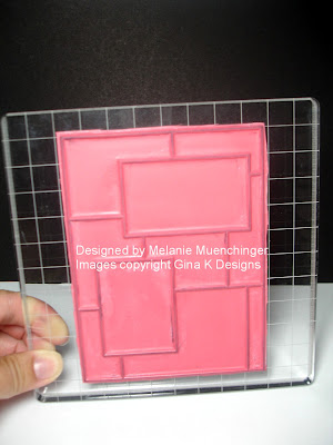 TIP: If this is the only BIG stamp you have, leave it on the block! :)
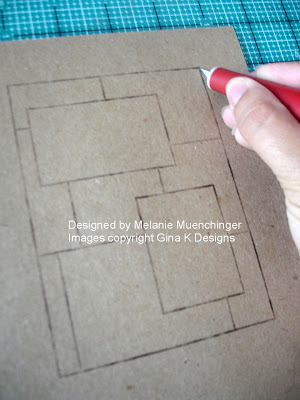
Now, you're going to want to make some masks. Keep these with your set, they will allow you a variety of looks and can be used again and again. Stamp the grid into the middle of a thin sheet of scratch paper, I usually just use printer paper, the thinner the paper you use the better, a thick paper will "bump back" the image and keep all of your image from stamping properly up to the edge of your masking. (Here I'm using text weight kraft paper just so you can see it better when I place it over a white sheet I'm stamping on) Trim along the edge with a craft knife, here I'm using the Tim Holtz retractable knife. You can finish this up with scissors, but the reason I start it with a knife is so I don't have to cut in from the edge to get to the image, this piece will just fall out and I'm left with a window.
 Be sure to leave a couple inches of room on the sides so that when you are sponging or stamping off the sides it won't hit your paper outside the mask.
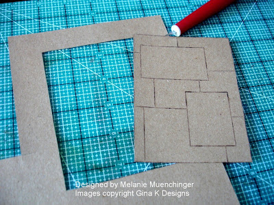 Now cut out the two top rectangle layers", you are left with FOUR pieces you can use: the large window (to use like a reverse mask), the grid with the two cut outs (you can stamp inside these), and then the two little rectangles you can place over the rectangles when you are sponging to keep these areas clean and blank.
 I will show you how to mask with all these in my next post!!
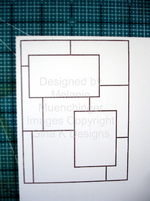
Now , here is a pic of me stamping the grid onto my CS I will be using on my project, you can just see the edge of the white paper peeking out. So I only have to cut on two sides, I make sure the line on the grid block that is lined up with the top of my image is parallel to the top of my CS, that way I know it will be straight. I also bring it down about 1/8" from the top and 1/8" over the side (It make look like its further over on the left, but it's the angle I'm taking the pic at)
 When I pull the stamp away, my CS is ready to cut on the right side and below the image so it will be perfectly framed up on my paper. Stamping it this way into the corner of a sheet of CS, I can get 4 mats from an 8 1/2" by 11 piece with very little waste. Love it!
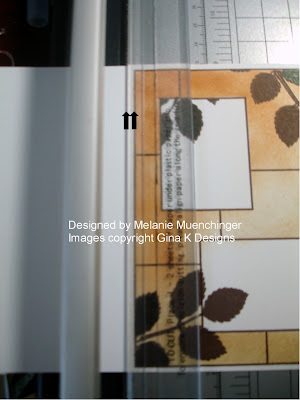
 Now, to cut! Your cutter may be a little different than mine, but see how the border of my stamp is parallel to the edge of the plastic grip and cutting track? I put in 1/8" over, this way I will come out with a mat that has even borders on all sides, AND, even if I didn't stamp it exactly square to the corner, because the image is a rectangle, when you line it up to the border of the stamp and NOT the bottom of the cardstock, all the sides will be squared up. I love that! You will have a mat ready to adhere to your A2 card front.
 Okay, I'm off to get the next post ready to go with all the masking tips and my finished card! We have a blog hop for "Inspiration Mosaic" next week, including our Gina K Design Team and Center Stage Spotlight ladies from July, can't wait!
This first pic shows what the mosaic grid looks like adhered to the 6x6 acrylic gridline block. (First I did a superclose trim with my Tim Holz scissors) I have it centered two squares over on each side with the top edge of my image (not the top of the rubber!) lining up with the gridline on my block, make sure both corners meet the line and it WILL be lined up! It doesn't quite meet one of the lines at the bottom, but that's okay, you will only be looking at this top line when you are stamping.
 TIP: If this is the only BIG stamp you have, leave it on the block! :)
Now, you're going to want to make some masks. Keep these with your set, they will allow you a variety of looks and can be used again and again. Stamp the grid into the middle of a thin sheet of scratch paper, I usually just use printer paper, the thinner the paper you use the better, a thick paper will "bump back" the image and keep all of your image from stamping properly up to the edge of your masking. (Here I'm using text weight kraft paper just so you can see it better when I place it over a white sheet I'm stamping on) Trim along the edge with a craft knife, here I'm using the Tim Holtz retractable knife. You can finish this up with scissors, but the reason I start it with a knife is so I don't have to cut in from the edge to get to the image, this piece will just fall out and I'm left with a window.
 Be sure to leave a couple inches of room on the sides so that when you are sponging or stamping off the sides it won't hit your paper outside the mask.
 Now cut out the two top rectangle layers", you are left with FOUR pieces you can use: the large window (to use like a reverse mask), the grid with the two cut outs (you can stamp inside these), and then the two little rectangles you can place over the rectangles when you are sponging to keep these areas clean and blank.
 I will show you how to mask with all these in my next post!!
Now , here is a pic of me stamping the grid onto my CS I will be using on my project, you can just see the edge of the white paper peeking out. So I only have to cut on two sides, I make sure the line on the grid block that is lined up with the top of my image is parallel to the top of my CS, that way I know it will be straight. I also bring it down about 1/8" from the top and 1/8" over the side (It make look like its further over on the left, but it's the angle I'm taking the pic at)
 When I pull the stamp away, my CS is ready to cut on the right side and below the image so it will be perfectly framed up on my paper. Stamping it this way into the corner of a sheet of CS, I can get 4 mats from an 8 1/2" by 11 piece with very little waste. Love it!
 Now, to cut! Your cutter may be a little different than mine, but see how the border of my stamp is parallel to the edge of the plastic grip and cutting track? I put in 1/8" over, this way I will come out with a mat that has even borders on all sides, AND, even if I didn't stamp it exactly square to the corner, because the image is a rectangle, when you line it up to the border of the stamp and NOT the bottom of the cardstock, all the sides will be squared up. I love that! You will have a mat ready to adhere to your A2 card front.
 Okay, I'm off to get the next post ready to go with all the masking tips and my finished card! We have a blog hop for "Inspiration Mosaic" next week, including our Gina K Design Team and Center Stage Spotlight ladies from July, can't wait!
 Friday, July 24, 2009
Angel Baby
Here's a really easy card to make with "Wee Tees", I was inspired by one of the fancy corner punches I have and how they look like little wings, thought they'd be adorable paired with the onesie and little halo (traced with the Stardust pen) in this set. Card uses Paper Temptress Metallic Amethyst with White Diamond, and the floral background and pieced onesie use the Gina K "Springtime in Paris" digital pack.

The DP actually started as a square; I cut around the flower pattern through the middle and then spread it out to reveal the white underneath, to resemble billowy clouds. Last, I added a few white paper flowers and Basic Grey buttons.
Our Gina K Designs sneak peeks start THIS Sunday night! Mine's up first, eeek!! I am SO excited about this one, (of course, I'm always excited, but it is completely different and so versatile that I'm going to be using it with our other new sets in the previews!) Wait til you see! The only thing I'm going to say about it now, it's gonna be "BIG"!* ;)
*that's a little clue

The DP actually started as a square; I cut around the flower pattern through the middle and then spread it out to reveal the white underneath, to resemble billowy clouds. Last, I added a few white paper flowers and Basic Grey buttons.
Our Gina K Designs sneak peeks start THIS Sunday night! Mine's up first, eeek!! I am SO excited about this one, (of course, I'm always excited, but it is completely different and so versatile that I'm going to be using it with our other new sets in the previews!) Wait til you see! The only thing I'm going to say about it now, it's gonna be "BIG"!* ;)
*that's a little clue
Monday, June 29, 2009
Framing with Nestabilities
On today's sample I used a corner rounder on the bottom of my card base and some Nestabilities to frame up the "Arranged with Love" image. Let me show you how easy it is.
 If you have Nestabilities, it is very likely the Scalloped Rectangles are part of your collection, they were one of the first few sets I bought, as most stamp images fit and frame nicely in a rectangle and look so elegant in this classic shape. To perfectly frame this large image, trim the stamped image on the line. Die cut two of the largest Scalloped Rectangles of the same size, here I used Pure Luxury White.
 Then overlap them and adhere the first one over the top three humps of the second, lining the scallops up on both sides. The seam will not show once you place your image over it.
 I used a pastel pink scheme for this card and added "Congrats!" to celebrate the arrival of a baby girl. The butterfly is from "Take Flight", covered in Stardust Stickles.
 If you have Nestabilities, it is very likely the Scalloped Rectangles are part of your collection, they were one of the first few sets I bought, as most stamp images fit and frame nicely in a rectangle and look so elegant in this classic shape. To perfectly frame this large image, trim the stamped image on the line. Die cut two of the largest Scalloped Rectangles of the same size, here I used Pure Luxury White.
 Then overlap them and adhere the first one over the top three humps of the second, lining the scallops up on both sides. The seam will not show once you place your image over it.
 I used a pastel pink scheme for this card and added "Congrats!" to celebrate the arrival of a baby girl. The butterfly is from "Take Flight", covered in Stardust Stickles.
Have a great day!
Subscribe to:
Posts (Atom)