Showing posts with label Color Challenge. Show all posts

Friday, March 11, 2011

StampTV Color Challenge 15

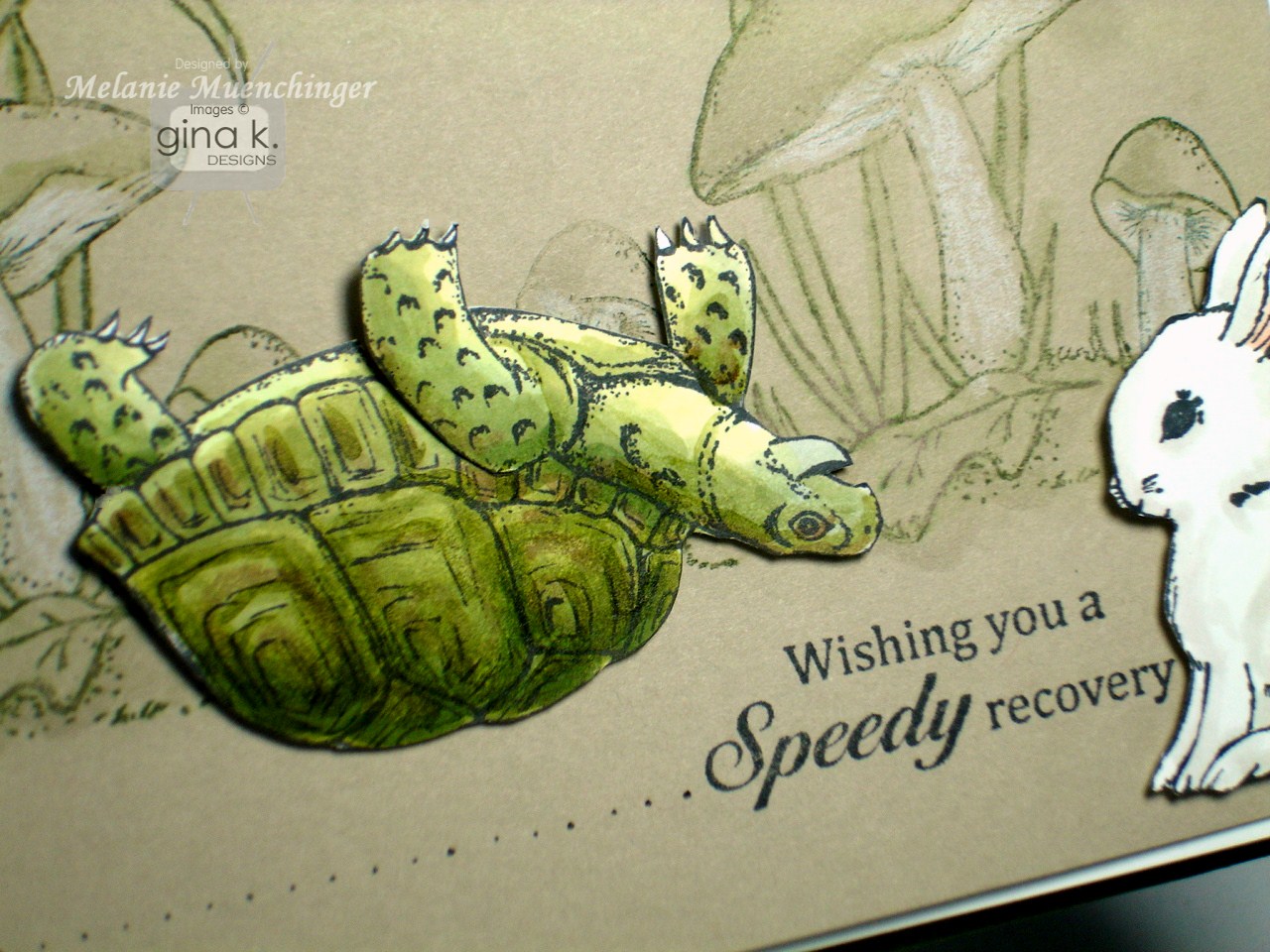
Today's Color Spotlight challenge is White, Fresh Asparagus and Soft Sand. These colors were perfect for an idea I'd had a couple weeks ago, I'd already colored and cut out the turtle from Theresa's "Little Critters" for it. The "speedy recovery" sentiment made me think of when turtles get flipped over and have to right themselves again. (TIP: If you're going to have him upside down on your project, be sure you color him that way, shell facing down so the highlights will be on top and the shadows beneath.) Anyway, when I put him on the card, I was afraid that to some, especially with that greeting, he might look like he was dead, yikes! (boy, wouldn't that make the "speedy recovery" seem snarky!!) Not *quite* what I was going for...
So I needed to add some motion to give it a positive spin (pun intended, hee!)! Here's to getting back on your feet soon! Bunny from "Basket Blessings"


Make this just like a spinner card, cutting a half circle track with a craft knife your pop dot can fit through and a penny on either side.
I found making a quick background was really important to ground the turtle, otherwise he would look like he was floating. Here I just stamped the mushrooms in green, smeared them a little with a water brush, and added a little white pencil, easy peasy!

Be sure to use the tag STVCSP15 when you upload your creation using these colors to the STV gallery.


Hope you'll play along with us and good luck winning some free stamps! Have a terrific weekend!!

Friday, March 4, 2011

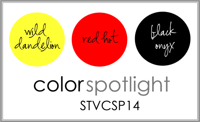
StampTV Color Spotlight #14

Happy Friday! Welcome to our StampTV Color Spotlight challenge!
You know I love red and black and throwing in a gorgeous sunny yellow like Wild Dandelion makes such a vibrant, cheerful card! I paired it with the daisy grouping from "Spring Basket" and Cuttlebugged the Dandelion layer with Victoria.

Greeting from "Basket Blessings" is stamped onto a Labels One die cut, Ribbon is 5/8" stitched Pure Luxury. Flower bunch is cut out and popped up. I used two white sateen flowers and a Basic Grey brad to create my embellishment. Bow is tied with the Bow Easy.

Please upload you creation using this color combo with the tag STVCSP14 to the STV gallery, I hope you'll play along, good luck winning some stamps!
Have a terrific weekend! (No, I still have not had a chance to finish that project I mentioned the other day, it's coming!!) :)

Friday, February 25, 2011

Color Spotlight #13

Happy Friday! Forgive me for not posting my tip sheet and a few other things I promised yet, but we've been so sick here and I missed the last few challenges so I pushed this one to the top of my list!
Pure Luxury Creme de Menthe, Red Hot and Lemon Drop! These colors inspired a sweet Spring card with just a little heat!
I embossed the Red Hot with the Cuttlebug Flourished Frame folder and then die cut a Labels Eight from White to stamp my "Basket Blessings" sentiment on. (I don"t know anyone getting married now but I just HAD to include a bridal greeting in this springy set!) I sponged a bit of pale yellow and green inks (which I also used to stamp the daffodils for a subtle repeat of my popped up flowers) onto the label before removing my die. Popped up flowers are colored with Copics

TIP: To create some greenery from the "Basket Blessings" set, stamp the daffodils from the set in either size and color them green. Then snip each flower into 5-6 pieces and layer them under the flowers, leaves from flowers, fun and easy! :)
I added some little adhesive rhinestone bling trails after popping the flowers up. Don't forget to stamp up the inside of you card and your envelope with those pretty flowers!
Hope you play along, you could win new stamps! Be sure to use the tag STVCSP13 when you upload your new creation using this beautiful color combo to the STV gallery!
Have a terrific weekend, come back and visit for more basket stuff!

Friday, February 4, 2011

STV Color Spotlight 11

Happy Friday!! Time for a new Color Spotlight Challenge with these beautiful Pure Luxury hues!!
On the coldest day here in years I decided it was time to get some butterflies, Spring IS on its way! :) I made this sample with "Fun Year Round", and my butterflies from "A Beautiful Life" and "A Year of Borders".
I started stamping the frame onto White and then stamping in some of the butterfly border, masking some of the circles, but letting them overlap the circles in other areas. Next I colored in some of the butterflies and areas in and around the circles in R02 and YR16. On the butterflies I added YR18 and R83, R85 for contrast. I used 100 Copic in the corners.
I layered these die cut circles over this large flower from The Paper Studio and added a few cut out butterflies covered with Stickles, adhered with pop dots.

This card makes me happy, I hope it does you! :)
Be sure to use the tag STVCSP11 when you upload your creation with this color combo to the STV gallery for a chance to win a free set of stamps from Gina K Designs!


Friday, January 28, 2011

STV Color Spotlight #10

This week Gina has featured one of my favorite "go to" color combos in the StampTV Spotlight Challenge, black, white and RED (hot!)

I used "Buds and Vases" this week, and have a coloring tutorial to go with!

First color the flowers with R29, Lipstick Red goes beautifully with the Pure Luxury Red Hot.
Next color the leaves with YG93.
Now trace the veins and under the flowers where they overlap the leaves with G99. You could soften these lines with YG93 again or do tip tip coloring with these two greens to create an in-between shade.
Next, using R59, start near the flower centers and make quick flicks outward, going over the little star burst lines in the middle of each. Leave the centers white.Last, and this step is optional, start on the outside of the flower petal and make tiny flicks inward toward the flower middle to create a frilly look. Without the petals look flat (which is cool, some varieties look like that!) With these strokes, the petals have some folds.
Here is a closeup, the pot is paper pieced with Basic Grey Origin DP and shaded at the bottom, left and under the rim with E71, but W or C gray Copics would work as well. I popped up the flower and trio and added one cut blossom over and one under.
The Black Onyx layer is Cuttlebugged with the Victoria folder, rubbed with white craft ink and the center is cut out with a Large Scalloped Rectangle die to reveal the white layer underneath. I used a Bow Easy to create the double bow with the Pure Luxury Satin Ribbon.

Be sure to use the tag STVCSP10 to the STV gallery, I hope you'll play, you could snag from free stamps, good luck!

Have a terrific weekend! Thank you for visiting me!

Friday, January 14, 2011

Color Spotlight

Hello! Time for a Color Spotlight challenge with Gina K and StampTV! Today's "Where Your Heart Is" card has just a few layers and no DP, I really wanted to focus on this fresh color combination. Cardstock is Pure Luxury White for the images, Red Hot mat and Sweet Corn as a base.
I stamped the images out twice, filled in the hearts with Copic R 27, and then made a green background for one with G99 and yellow for the other with Y15. I wanted to have the "i love you"s repeat around the card, isn't it fun stamping the words in the different portions of the box? TIP: You can do this on all sides as well as around the outside of the rectangle or going around a corner. Hands are colored with E51 and E21. The double hearts and multiple greetings say that you mean it "so much!!" :)
Hope you'll have time to play this week, remember to use the tag STVCSP8 when uploading your new creation with this color combo to STV! Good luck, I hope you win some free stamps!
Have a terrific weekend! i love you! ;)

Friday, January 7, 2011

Color Challenge and New Stamps are now Available!

Good morning! New stamps are available, check them out here! Tip sheet for "Where Your Heart Is" coming soon, today I have short tutorial using the set.


Time for another Color Spotlight Challenge! Be sure to upload you creation to STV with the tag STVCS7 for a chance to win free stamps!

Here is a sample I made for my little boy, he draws pictures for me all the time, so I made him a simple card to show him how special his creations are to me! Of course, this "pictures" sentiment could also be talking about photos, that was intentional, so family members can convey their appreciation for things given or mailed. The way the sentiment is arranged, you can also add "letters" or "prayers" in place of pictures. TIP: Stamp the sentence first, then add the single word on a grid line block, lining up the line under your stamp with the your on your already stamped greeting and then stamp.

The turquoise base is sponged at the bottom with coordinating ink and the Sweet Mango is sponged as well to give them a little glow. I sponged tumbled glass distressing ink below the hands and wild honey ink above, then stamped the hands again so I could color and cut them out to go over the sponging. With the orange ink on top, it looks like the light is coming from above, so here is a simple tutorial to show you how to color the hands when your "light source" in on top. I'm not bothering to stay in the lines today, since I'm cutting them out, keep that in mind! :)

First color, the bottom of the hands, underside of fingers at top and thumbs with the lightest flesh tone you will be using, I used E00, as my hands are pretty pale!! Leave the very top sides white.


Now go in and color the underside of the hands, thumbs with a darker flesh tone, here E21. Also lightly trace, the creases on the insides and undersides of fingers. Stop here for a more dramatic look. Go to the next step for a more blended look.

To blend the darker shadows, go back over these areas with E00 again to soften the edges of the darker marker. That's it! You can do this! :)


I will do more tutorials to show how to give the hands more dimension, how to have the light source coming from different areas and show other colors to use for the hands. I will be making cards for Operation Write Home with this set and they will need hands of all colors. Check back tomorrow for a special post about Operation Write Home! :)


Have a great weekend, thanks for joining us at the party last night if you missed it, the thread is still up you can go check out what you missed!

Friday, December 10, 2010

STV Color Spotlight #5

Happy Friday, are you ready for the weekend?! Get yourselves ready for another Color Spotlight challenge with Gina K and the team! Today's colors are....

I thought these colors would be gorgeous with my "Festive Frame" set, so I stamped the frame in black on Pure Luxury White, and colored wit with Copics V15 and V17 for the blooms). I added gold adhesive nail heads, then cut it in half, notching out a portion an snipping around the pine cone so I could overlap the images, lining up the border to make a square mat. (I didn't have to make a sqare card here, but don't think I've tried it with this frame yet, so I figured "hey, let's see..!") :)

I adhered the two halves to a square Fresh Asparagus base and die cut a Petite Scalloped Circle for the label image from Theresa's "The Giving Tree" inked up in Memento Grape Jelly. I did a little sponging and added a holiday greeting from "Mugs and Kisses".
Depending on how you cut and color it, the transition is pretty seamless (for instance, I added some swipes of green to make more pine needles on the left side after adhering), but you can also use some embellishments or cover the the seam with ribbon. I like this a lot, will do it more often!
Hope you'll try this color challenge this week! Be sure to use the tag STVCSP5 when you upload to the STV gallery, and be sure to check out Gina's video and samples from the rest of the team, I hope you win some free stamps! :)

Friday, December 3, 2010

STV Color Spotlight #4

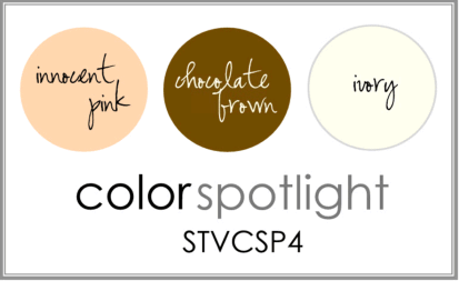
New stamps now available!! :) Here is a card I made for this week's StampTV Color Spotlight Challenge, using Innocent Pink, Brown and Ivory.
I stamped the mug onto Basic Grey Olivia paper, this floral pattern is one of my favorites in the pack! Then I used R27 Copic to color over the inside of the cup and the dish, and R02 on the sides of the cup and handle. So the cup and saucer are all ONE piece, no extra piecing, just color right over the patterns! I cut out and popped up a little of lump of sugar and the tea tag, each stamped on white, I also stamped a heart onto the tag.

I think "hi, sweet tea!" is such a fun greeting for your significant other or your bestie!
The background is embossed with a Cuttlebug folder, I think this swirly border is SO fun with this set, has a steamy, magical feel to it! I used Innocent Pink for the bottom half to look like it's sitting on a tablecloth and rubbed some white ink over the pink to make the embossing pop out a little more. Isn't the silver spoon a classy embellishment? You can put this on the card anywhere, at any angle you need a little sumthin'....Cardbase is Pure Luxury Chocolate Brown and ribbon is 5/8" Chocolate stitched.


Please upload your card using the tag STVCSP4 to the STV gallery, hope you'll play and maybe win some free stamps!
Have a tea-rific weekend!!

Friday, November 26, 2010

STV Color Spotlight #3 AND Shopping special!

Hello! Hope you all had a fantastic Thanksgiving! Today, not only do we have a color spotlight challenge, but Gina has also issued a Black Friday Coupon, good through Sunday, I know you'll want to take advantage of it!! Spend $35 and get any one of these 6 Gina K sets below (some of my favorite and most often used of hers!) FREE, your choice which one! You can also place multiple orders of $36 or more to choose more sets!
Yes, yes I used the butterflies AGAIN, but I HAD to when I saw the sets in the special, combining my "A Year of Borders" with "Take Flight" , one of my favorite butterfly sets ever! I love all the possibilities having the large butterfly adds to the butterfly border and vice versa! This week's color challenge is Ocean Mist, Green Apple and White, so I used these for my mats, and then stamped the border in aqua, inking up just one in black before stamping. I colored that one, then stamped the large butterfly in Memento Black colored with Copics B00, B02 and G99, and cut it out to pop up.
Crystal Stickles (which is perfect for this color challenge, iridescent with blue green sparkles!) and a trial of adhesive bling add add shimmer to this card and wind around this beautiful sentiment from "Take Flight". As you can see, these sets are a match made in heaven, but with the special on top of that you really can't miss! Just for example, buy "A Year of Borders" and a pack of each of these two colored cardstocks in the challenge (or anything for an additional 11.05) and you'd be getting this perfectly coordinating "Take Flight" set for FREE! :) What a deal!

So have fun shopping! And we hope you find time to play the color spotlight challenge this week, you could win free stamps! Be sure to use the tag STVCSP3 when you upload your card to STV using these colors to the gallery for a chance to win!
Gotta run, SO much stamping to do for our release next week, can't wait to share the snippets and sneak peeks!

Friday, November 19, 2010

STV Color Spotlight #2

It's the weekend, hurray! Time for another Color Spotlight Challenge with Gina K and the gang, here is this week's combo:Today I used my border from "A Year of Borders" that matches my "Wild at Heart" set. This was my first opportunity to play with this border and I am thrilled with how it turned out! Great to use when you need quick pops of color without coloring an image! :) These bold images are actually "negatives" of that negative frame image ("filled in") in actual and smaller sizes.
I used markers to match the Lipstick Red and Green Apple mats to ink up the petals and centers, coloring the red parts quickly first with a brush tip, then the green and huffing on it before stamping, and then stamped them on two pieces of white cardstock. TIP: If you want a more blended or watercolored look on these, after stamping in color you can drag a wet brush over areas to let the color bleed a little like I did here in the centers. I did the same thing on the front side of my envelope and then on a scrap of white CS that I could cut out to pop up individual flowers around the die cut oval label and greeting from "Versatile Verses".
I also used "In Stitches" around the edges, stitched ribbon tied near one flower like leaves and a stem, and embossed the green layer with the Fleur de Lis folder for some added texture, rubbed with green ink on the edges to make the embossing pop.
Hope you'll find some time to play, just upload your creation using this color combo to the StampTV gallery with the tag STVCSP2, you might win some free stamps! Be sure to check out the Friday video and all the other samples from the team as well with these colors on STV.
Still got a sick kiddo, so I haven't stamped in days! Praying for a better weekend, healthy for all and super productive, same goes for YOU! :) Thanks for visiting!

Friday, November 12, 2010

STV Color Spotlight #1


How's this to brighten up your day?! Gina throws down a color combo on StampTV that's sizzling hot AND super cool!

I used my new "A Year of Borders" set, the butterfly border being the best fit for today's combo. It's such a happy stamp! I did a spotlighting technique here with my circle punches, so get ready for a little mini tutorial! Stamp the border once on your mat. Now stamp it again on a separate piece of cardstock and punch out random areas with two different sized circle punches (3/4" and 1"). You will line these up over the first border like you do when paper piecing. I also punched out some slightly larger circles (1" and 1 1/4") in the Red Hot and Turquoise Sea to mat the stamped circles. The red string is embroidery floss.

I left the back border uncolored and then colored in the punched images with the red and turquoise Copics. I staggered the color of the mats behind them and then colored them in with the opposite color, so one with a red mat had a turquoise butterfly and vice versa. Some have more than one image in them so I used both colors. Isn't that a fun look? The up and down placement of the circles gives the border and card a lot of movement.

The tiny red butterflies that are popped up, I just inked up one little butterfly from the border and stamped it twice onto a little scrap of Red Hot cardstock, trimmed them out with my Cutterbee scissors bent the middle and attached them with pop dots. I love how tiny these are! :) I added a fine dotted trail behind each with a black pen. Greeting is from "Labelled with Love".


Please go check out Gina's video on StampTV where she creates a card from start to finish using this color spotlight and take her challenge, you could win some free stamps!


Have a fabulous weekend!