Tuesday, February 24, 2009

Bold Thank You

Today's sample uses Bold Flowers from the Floral Frenzy kit. Although these stamps lend themselves to lots of other colors papers than what is included in the kit, I am challenging myself to show you a lot of things you can make using ONLY materials in the kit, with the exception of changing out the inks. Any color ink can be used, you don't HAVE to match your colors with the patterned papers, because you have the gorgeous 4 neutrals in your kit, just use whatever colors you are "feeling" that day!) ;)

But I did include PINK today (from the kit!) LOL! I found you can carefully ink up just one row of dots from the background stamps in Bold Flowers with a marker, (I chose the middle line of dots on the stamp so the block wouldn't rock), and line that up with the middle line on your grid line block andalign that line with one of the stamped dotted rows on the pink, then stamp! I like how this detail draws your eye back in forth in a zig-zag Z down the card. The sentiments are punched out with the SU! 3/4" and 1/" circle punches and popped up on dimesnionals (uh oh, just realized I used dimensionals,(not in the kit) but you have these right?? It's really hard for me to stay away from those, dimension just makes it "pop"!) , the little dotted scraps are stamped in Rich Cocoa Memento ink with the polka dot stamp from this set, and scallops on the ends to match my flowers were created with the threading water punch. Foliage is inked up with Old Olive. All papers, base and layering, are from the "Floral Frenzy" Kit. This clean and simple creation makes for a very happy thank you in under 10 minutes!


Have a great day, thank you for visiting! Remember, Paper Temptress Party tomorrow night! and don't forget to play the StampTV challenges, there's free stamps to be had!

Monday, February 23, 2009

Easy as 1, 2, 3!

A recipe for success: 1 ink, 2 stamps, 3 papers= 1 fast and FABULOUS card!

Today's sample uses two beautiful new papers from Paper Temptress, Elegant Laid (Avalanche White) and Silver Lustre, a kind of prismatic holographic paper that allows the ink to "slip" below the surface to create an almost 3-D effect. Clcik the pic for a closeup to see the silver shimmer! The silver stripes are so beautiful by themselves, I stamped Gina K's "Tropical Flowers" image on top in Memento Tuxedo Black ink (the silver paper turns the black ink a dark gray) and mounted it onto SU! Basic Gray CS. The Elegant Laid paper, which I stamped my greeting onto (These are words put together from my "Say it with Flowers" set tp form the one sentiment, stamped off Memento Black once to get a dark grey ink to match the flowers) has a very fine striped texture as well. I made sure the lines were both going vertically in my design, gorgeous with the vertical of the flowers. The matted panels are all popped up on dimensionals. This a is a 4 1/4" square card.


Another terrific feature of this Lustre paper, the back is smooth white, so this makes a fantastic card base: outside you have a beautiful silver finish, the inside is white for writing your message! Above I have it pulled over so you can see the front and the back.

Love this simple elegance, this was a VERY simple card, but I think it's just stunning! Special papers like these with a beautiful image make it easy...you don't even need embellishments or ribbon, the whole card front looks like a gorgeous piece of striped satin!

Now! there are several things you need to mark your calendar for this week:

Patricia is adding 50 NEW kinds of paper to the Paper Temptress store this week, and you are invited to come out and join in the fun! There will be TWO lucky winners who will receive one sheet of all the new cardstock, that is a value of over $29.00 just for attending the event!! Just another great reason to join us (Patricia, me, the rest of her design team, and the rest of her paper lovin' fans!) in the Paper Temptress Paper Lover's Forum on Papercraft Planet, Wednesday night, February 25th, at 8:00 PM Central time, (9:00PM Eastern time 7:00PM Mountain Time and 6:00PM Pacific Time.)

Also, there is a new challenge with a prize (free stamp set!) EVERY day over at StampTV this week! Yesterday's challenge was thumping, watch the video and upload your card to the site for a chance to win,( it's a random drawing) you have until Wednesday for that one! Challenges will be hosted each day by a different member of the Gina K Designs design team (one by yours truly on Friday!) This will be going on EVERY week so get in the habit of playing! :) Let's go see the challenge for today!

Sunday, February 22, 2009

Bathtime for Isabelle!


Here is a card I created for the My Favorite Things Masking Challenge. Going through my MFT, MFTPresents, and BCDZYNS stamps, I didn't right away see any images that were begging me to put them together, and then shazam! Little Isabelle from Stephanie Fizer and one of Annie Lapointe's tubs, made for each other, don't you think? Her little bare shoulders are perfect for tubby time, and their styles really go together to look like it could very well be one image. To put them together, start by inking up only the tub, no ink on the flowers, and stamp. Now cover the tub with a post and stamp Isabelle so her head and shoulder are peeking out. I colored everything with Copics (the focal point started as a white piece of Gina K Pure Luxury CS, I filled in the background with a pale aqua Copic), and added a few rhinestones bubbles above. The tub, puddle and fish toy below are all covered with Crystal Lacquer. The dark red background DP is from the Basic Grey Bittersweet pack which inspired the fabulous colors for the tub. Ribbon is SU! 5/8" rose and base is Paper Temptress Berrylicious.

Saturday, February 21, 2009

Thank you, thank you, THANK YOU!

When you say something three times, you REALLY mean it LOL! StampTV is up to almost 1200 members, and our team is just so excited how excited you are!! Here's a card I created using the "Bold Flowers"set from the new kit, without the flowers! I love these "Neopolitan" flavors (er, papers!) in the "Floral Frenzy" kit, so I pulled out a few to decorate this trifold card, base is the new Chocolate Kiss CS from Gina K designs, also from the kit! (measures 8" by 5 1/2", scored at 2 1/2" and 5 3/4") EDITED TO ADD: this fits in an A2 envelope :)
I stamped out "thank" and "you" three times each in Rich Cocoa Memento ink, and punched them out with my 3/4 inch circle, I love the big and small rim that leaves around the circle stamps. Then I layered them on circles punched from the kit's pink and chocolate layering papers. On the front, the layered "thank" is attached on the left side, "you" is attached on the right. "You" is popped up on a dimensional and overlaps the front edge so you can tuck that flap in to fold it together, see pic.
When you pull the left flap open, you reveal another "thank" adhered on the back of the front one (to say thank you a second time,

and when you finally open it up all the way, you see the third "you"...


" Thank you, thank you, thank you, isn't that cute?! You can never go wrong with pink and chocolate, sigh!!
So how many of you bought the kit already?? Did you see Gina is offering up the downloads of both new digital paper packs for free right now? (the kit includes this as well, but already has several papers printed out for you.) Download it today and try this fun designs (minus the round greetings though, you have to purchase the kit to get the stamps!) I am so excited about the bonus pack she is releasing tonight to coordinate with them, not even the design team has seen these, so you can bet I'll be stalking her blog LOL! (and then run over here and gush about it!) :)

Friday, February 20, 2009

Okay, this is funny....

I went and had my first mammogram Friday morning. I won't go into all the details, but one thing I do have to share (besides telling those of you who are afraid to go have one, it's not so bad), when the female tech led me in my gown into the room and began explaining what she was going to do, I looked up and saw this taped to the top of the machine:

Me: Eeeek! (pointing!)
Tech: Hey, we have to look at something while we do this! (laughing)
Me: well, HE doesn't have to look at ME! (covering GC up with my jacket...)

I mean, really, as if you're not feeling self-conscious enough already!!!

Did you see StampTV is already up to almost 1000 members in less than 24 hours?? Please go join if you haven't already, I have a *feeling* there may be a drawing for another prize out of the members :) the place is already rockin! Don't forget to go order your FREE digital paper download from Gina, too!

Thursday, February 19, 2009

(Today's the DAY!) Bold and Elegant...


Have you ever looked at Gina's picture or read her blog and thought: "I wonder what she sounds like? what she's like in person? what it would be like to stamp with her?" Well, now you can find out! After year and a half, Gina's labor of love, "Stamp TV" is finally here: a free resource available to all stampers, featuring broadcast quality video tutorials by Gina herself (along with a lot of other fun STUFF!) using, of course, Gina K designs Products! Not only will she show you how to create beautiful projects, but she'll be releasing limited edition stamp kits several times a year filled with the Gina K materials you need to complete them right along with her on the video!

My sample today uses both stamps sets included in her first Showtime Stamps Kit "Floral Frenzy" : "Bold Flowers" a big and chunky modern set, and "Elegant Flowers", classic sentiments, line art and silhouette florals. You are correct if you guessed these irises are from "Elegant Flowers", but where's the "big and chunky?" you're probably thinking?? You'll be thrilled to find "Bold Flowers" includes two 2 inch square background stamps, one being this antique crackle pattern! Is that gorgeous or what? I stamped out the irises in Memento Black on Gina K Pure Luxury layering weight Ivory CS (yes, you read that right, IVORY!!!) and colored them with Copics (blue-purple irises are my fave!) Then I stamped over them (didn't mask) with the crackle stamp in Antique Linen Distress ink.

I stamped it 4 times to cover the whole mat, the uneven lines make it a cinch to "line up", no need for a stamp positioner to get even coverage, and I love that!) Everything else you see here is included in the kit: brads, this beautiful rust patterned paper (you get an assortment of several patterned sheets in the kit plus the digital file to print as much as you want when you run out!), this thick BLACK CS, and gingham ribbon. You won't believe when you see the rest of the kits contents (because there's more!) any more than you will believe the price, it's such an incredible value, but I'll let Gina tell you about that on her blog! Please go check and see all that Stamp TV has to offer, and check out the kit, (there's even a video that shows you the contents closeup!)available only at Gina K Designs!!
You can find lots of other fabulous projects with Floral Frenzy on these dt blogs:
Joanne, Erika, Theresa, Cindy, Emily, Jessica, Kurtis, Carolyn and Donna

A little hint...

Today I played this week's sketch challenge on Splitcoast : the half circles at the top were something I would have never come up with on my own! :) The images you see here were inked up with markers using a technique called "thumping".
And guess what? The materials used to make this project came from a special new product being launched tomorrow at Gina K. Designs!
Check out Gina's blog today and enter to win the "What's in the big brown box contest", then stop back tomorrow for the full reveal! More thumping peeks from our Gina K Designs team here:
Erika Martin: Stampin Mama

Have a great day!!!

Wednesday, February 18, 2009

Hip hip hurray!! The pub is here!

Just had to share : my first published card is now on the newsstands! CardMaker March 2009, (pg. 86, my new lucky number, hee hee!!) I love that my first published card just so happens to use my very first stamp set "Just So Hippy" (as well as "Hip Hop Accessories"), how appropriate! (That was not intentional, I submitted several others that first time, so it could have been any of one of my first several sets!) I actually spotted the magazine at Barnes & Noble a few weeks ago, but was waiting to get my issue in the mail so I could share a pic with you! (A few of you actually already saw it, and emailed me congrats, thanks ladies!) ;) Obviously I knew what the card was going to look like, but it was such a fun surprise to see how beautifully they photographed and staged it, I heart that daisy!! What a thrill!

So, I was going to put my extra copy that they send up for grabs here on the blog, BUT, I decided in the end I really needed to give this first one to "Mom", my first supporter! You understand, right? ;) But the next one (July 2009), I will, okay?? (That one has FIVE of my cards in it, squeal, can't wait, can't wait!)


The main reasons I *think* this one got accepted:

clean design, easy for any stamper to recreate, FIT the call (baby theme), some tradtional & non-traditonal baby card elements (hippos?), with a bit o' humor thrown in! ;)


The month I submitted this last summer, was my first time to try getting published, but as I said earlier I sent in several other cards that time too that did not get accepted. Carolyn wrote a post about r*e*j*e*c*t*i*o*n the other day, well, i know something abot that, too! I've definitely had more rejected than accepted! Out of curiosity I just went and counted all my submissions: about 1 in 4 has gotten published. As you know, I make a lot of cards, more than one a day last year! I don't submit everything I make ( less than 1/10th of what I created ), but try to figure out which ones I think have the best chances. (Lots of my personal favorites have been passed over! and I'm fine with that, it doesn't make me like the designs any less) Fortunately, with Cardmaker you can just email a picture, so it doesn't hurt to try submitting several, if it's not accepted (I prefer that term to "rejected!") you still have that card you love to do with what you like!! so GO FOR IT! Everyone will experience some rejection, but it's worth it (seeing your card in print is great, the money's not bad either, a very nice supplement to your crafting fund! I treated myself to a ton of Copics) ;)

Anyone out there have published cards coming out using my stamps? (I know Carolyn does!) Please let me know! I appreciate your support and the heads up! :)

Oh, I'd also love to know: any of you subscribe to Cardmaker? Any other pubs you like/had success with/ recommend I try submitting to? Thanks for reading and sharing my good news, please share if you have some of your own! Have a blessed day!

PS Did anyone notice the typo in the photo? how appropriate for ME, LOL! (the world's worst typist) That's cool, I've definitely seen it butchered worse! ;) BTW it's pronounced Men - chinger (rhyming with "ringer") just in case you were wondering! :)


PPS NOW, there are BIG THINGS going on over at Gina's today! HUGE! (I KNOW what's in the box!! do you?? and it's just the beginning! Go look!)

Tuesday, February 17, 2009

The Little Dipper

Just had to share a pic of little William making some hand-dipped creations for Valentine's Day this past weekend (as he counts them out: "e-LEV-en, TWEEEELVE,..."!) Boy, was I disappointed to find my camera needed recharging when I wanted to get a pic of him post-chocolate covered LOL! ("The best things in life are covered in chocolate!"*) I could have waited, but it was really a situation where he needed to get washed up ASAP!) We still had a bunch of chocolate left over after all the strawberries were done, so we ended up going through the fridge and pantry to see what else we could dip! bananas, graham crackers, Rice Krispie treats, ...YUM!! The chocolate is great for this project, "Ambrosia" brand, you can quickly melt the blocks in the microwave and it hardens up soon after dipping. He did a nice job, we will definitely pull this trick out more often than Valentine's Day to get them to eat their fruit!!


Hope you had a great Valentine's weekend with all your sweeties! I've really been enjoying all your guesses over at Gina K's today, out of 400 something repsonses, there are a couple that are close LOL! can't wait for you to learn more tomorrow! :)


* we have a few blocks left, now that the camera's ready to go, I may just have to let him have another go at it! ;)

Follow ME!

Today's card involved snipping apart the little dog-cat-mouse trail from "Warm and Fuzzy" to allow for a slightly different arrangement: I drew in a little string around the dog's leg with a black pen to pull the little mouse behind tempting the little cat, isn't that cute? (the cat's going along with it, but his expression, looking out at us, makes him look like he suspects something's up!) I pulled out my Kraft paper for this one to keep the focus on the scene rather than a bunch of other colors or patterns. The swirly lines and hearts image were perfect with the little string I drew, so I stamped that in Versamark on my Kraft Base and followed the line with some black dots (tied that in around my mat and with the dotted ribbon, too) these endless trails take you round and round the card! Hearts were accented the Inkssentials white pen. I love Kraft, black and white together.

Here is a closeup of the images (stamped in Memento Black on Gina K Pure Luxury 80 lb white CS). I colored them with Copics, the shadows were done with C-3 Cool Gray. I love how the little stripey tabby turned out, have fun adding spots and stripes to your open line art stamp images for a new look!


Thank you so much for following my crafting adventures each day! ;)
Now, please follow me over to Gina's for something new and truly exciting which will be available from Gina K Designs beginning on Friday! On Thursday, Gina and the rest of our Design Team will have previews to share. You won't want to miss it, so head on over to read Gina's hint for today!"

Monday, February 16, 2009

Paper Temptress Group at PCP!

Her is a sneaky peek of one of the newest paper offerings from Paper Temptress! I made a "to die for" card with it but am not yet allowed to share, can't even link it because it's not in the store yet, but...coming soon!!!

Up for a prize today? If you would like to know about paper challenges, see the featured "Paper of the Day", find out about paper specials before anyone else, ask questions about all things paper, and have a chance at weekly prizes, please go join Patricia's new Paper Temptress's Paper Lovers group on PaperCraft Planet! It's free to join and just takes a second (just click on join group under admin options in this link, Patricia will be drawing one lucky person from all group members who are signed up by Friday to win a large and fabulous assortment of her finest papers, including some not yet released, so don't delay! Winner announced this Friday!
BTW, A couple of my favorite stampers are on the Paper Temptress Design Team with me, among some other very talented ladies you may or or may not know yet, but you'll see when you get there! :) Don't wait!

Sunday, February 15, 2009

Chocolate Covered Fortune Cookies :)

I really wanted to get this completed to share with you BEFORE Valentine's Day as an idea, but,I actually didn't make it for a valentine, it's for a friend's birthday. You can find these adorable chocolate-covered fortune cookies any time of year at Target (and I've seen them at specialty candy shops, too) a pink container filled with 6 cookies is $4.99. I was happy to see the Friendship Fortune pack was pink with a dark chocolate covering (her fave!), they also have a Love Fortune pack, in a red container with milk chocolate. The cute container and decadence of chocolate-coated fortunes makes this a great value I think!

I looped some satin chocolate ribbon around the container and made a card to match. I stamped and masked my "Have a Cookie" fortune cookies in Rich Cocoa Memento ink on Gina K Pure Luxury 80 lb white CS (you can stamp with the brown and color with Copics, too!) and colored them with several brown Copics this time, before covering with Crystal Lacquer. Don't they look good enough to eat? Fortunately (LOL!) they have a pic of the chocloate coated cookies on the back of the container, which made getting the dark and light areas right much, much easier! :)Here's the closeup...
The little stamped fortune made with my "Have a Cookie" greetings I curled up and down with my fingers and attached in two spots with dimensionals. I love how it's just "floating" there slightly bent, looks like you just pulled out a real fortune and left it sitting out! Card base is Cameo Coral, almost a perfect match with this box!

Inside I stamped the sentiment from "The Best Things in Life" in Rich Cocoa and covered the "chocolate" in Crystal Lacquer as well.
My plan is to gift these to my friend with my (now secondhand) complete collection of the "Twilight" series (which I just went through in about a week and a half, (it was a nice escape from some things I have going on right now, but good to be done, as staying up all night turning the pages was definitely cramping my stamping time!)) Hopefully she won't mind that I already read them, I think I'd pass out from shock and gratitude if I got a big stack of books and chocolate to go with! And recycling these reads is the "greenest" way to go, right?;) Maybe if I'm nice she'll let me borrow them again sometime...
So I had a lot more turorials than I even thought, see my sidebar at right! Many I'd forgotten to label as such when I really went through...I have some broken down into "punch", "coloring", etc, but I think I might revise it even further to have separate categories for these instead of all under tutorials. I'll get there...!

Tutorials Aplenty! and Ch-ch-ch-CHANGES!

I am going to be doing some revisions on my sidebar, the lists are getting soooo looong! I knew I had a lot of tutorials, but eeek, almost 80?! Right now you can click the Tutorials label under categories and it brings them ALL up for you to browse. I WILL keep that, BUT I am also going to have a tutorial list where you can click on just the tutorial you want! I have several on coloring with different media, designs using punches, original 3D projects and templates, altered items along with some stamping techniques of course! So this list will be completed soon. I'm so excited about this, I turned up projects going through the list I'd forgotten I made LOL! I would also like to know: what tutorials would you like to see here? What techniques are you most interested in seeing demonstration pics and instructions? And then I can add to my "to do list"! ;)


One thing I will take away is the "sightings" lists for my stamp sets. I just don't have time to keep them properly maintained and even when I spend a LOT of time searching for cards, I still always miss some great ones! Instead I ask you to let me know if you made a card you want me to see that you made with my stamps, I would love to share these with everyone here from time to time! Just a leave a comment with a link or send me an email!

Saturday, February 14, 2009

How to Make a Towel Wrap (Viewmaster)

This is a card I created for the My Favorite Things Guest Designer contest this month, I got an ambassadorship for the month! :) I wanted to make a girl chatting with ther manicurist at the spa, it's a view master card that allows you to use several of the greetings from the "And Then I Said" set from BCDZYNs. The image is colored with Copics. I added a few images from Rupa's "Perfectly Polished" set, the polish bottles are popped up with glue dots and covered with Crystal Lacquer. The shadows for the bottles are done with a dark Grey Copic. Her shirt is pieced from Basic Grey Bittersweet papers, which I also used for the trendy "poured concrete" counter. ;) Her face is layered to give it a paper tole effect and self adhesive rhinestones bling the card and her hand up a couple notches!

The picture helps show how the card was assembled before I added the girl and other decorative elements that completed the scene. I used the SU! word window punch for the window, the sentiments are on a circle underneath, the brad allows it o turn. For more on View Master card construction, see this post.

I had several people email me or leave comments saying they don't think they could draw that towel...well, as with all the other "new do's" I've given her, it IS still her hair! Let me show you, you can do this. I colored in the bangs and left the rest of the hair white.


Then I made a curved line to connect the outside to the next section in.

I repeat this as I work toward her chin on both sides.


Here you have the complete wrap with just a bit of light gray on the underside of each section for a shadow. Finish coloring and cut out! ta da! I'll be back in another post to show you some flesh coloring tips, this is one of the only "lady" stamps I have, so I've gotten lots of practice with it! :) I have another card coming up soon that is similar in concept, really fun, can anyone guess?

Friday, February 13, 2009

Personalized Photo Framing Tutorial

Today's project takes a $2 frame and some family pics I took and "Photoshopped". I found two pics of my boys on different days marvelling at a butterfly, and a walk they took together on the beach. (After editing, I added some stamping and unique matting later, so please stick with me through the next few pics to see what I did and the final result!) :)
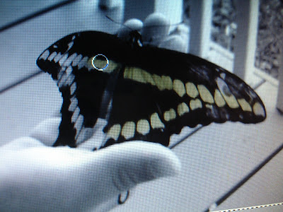
Here is my original pic, opened up in Microsoft Digital Image Pro 7. I take my pics with Sony digital camera. Jonathan was almost 5 in the pic, he'd just found a huge butterfly on our front porch.
Then I clicked on "Effects" and then "Black and White". I love black and white photos, you really focus on the shapes and "the moment"!

Now I'm going to use a tool under "Effects" called the "Colorize Brush", this allows you to tint certain areas of your photo in the color of your choice. Unlike the Paint Brush, this adds transparent color over your image so you still see detail rather than just a big stroke of opaque yellow.

Select your color and drag your mouse across the areas you want to tint. Although I don't use a lot of yellow in my projects normally, it's such a happy color and I wanted to keep the integrity of the butterflies true color (both happened to be this buttery yellow) I will tie this color into all three photos, very appropriate for these golden moments!

Now to crop it! I selected the same size as my frame opening and dragged it around until I had both of the most important elements inside, his little profile and the butterfly.

After printing them out and trimming (I use Kodak photo paper and an hp printer), I wanted to create some vellum mats that would kick this frame up a notch to look like frosted glass panes and highlight parts of my images. (You know those expensive ones you see at Restoration hardware of Pottery Barn?) Here you can see I chose two Nestabilites dies, a classic rectangle and a square, doesn't that look cool having the two geometric shapes offset like that? (I placed the full peice of vellum on top, then placed my dies over that to figure out exactly where to cut) I love this spotlight it creates on his face, it's before he lost that beautiful "little boy roundness" to his features and those beautiful little curls (his hair is pretty straight now, sigh!) It's okay the openings cover up parts of his head and the butterfly, just get the important stuff in there! :) I stamped "free..." from my "The Best Things in Life" set in Memento Tuxedo Black ink. (Heat set or blot to make sure the ink's dry before moving so you don't smear it when stamping on vellum.

Below is my finished project hanging in the powder room of our master bath. It's a small space so it was hard to get the colors to photograph exactly true. "The best things are shared... free... priceless..." I love how each picture is matted differently, it's so unexpected, rather than a centered rectangle in the middle of each, (but the right angles in all the cut outs makes them all very harmonious, throwing in oval or circles cut outs with these would have a very different effect.) TIP: Save your cut outs, you can do some cool layering things with all these perfectly cut vellum squares and rectangles in another proejct (I'll share some ideas with them later!)

Here is a closeup of my beach boys. There wasn't any yellow in the original, but I tinted William's t-shirt and the tie dye burst on Jonathan's back with the same yellow. See how I offset my square cut out here to allow tons of my room for my quote below, but you can still make out their footprint trail and cast shadows behind it...

A closeup of Jonathan's...

and one of my sweet William, taken just a few months ago. This one I cut with my largest rectangle die.

I hope you enjoyed this photo tutorial. I was so pleased with how artsy, expensive-looking, and personal this turned out! Hope it inspires you to try dressing up your favorite photos with a little creative (strategic!) editing, stamping and papers before hanging them up! Projects like these would also make great gifts for friend and relatives, just ask them to email you their favorite photos! You can do this!!