Monday, November 30, 2009

Sneak Peek: "Tech Talk" and "Lovely Shelf"

Hello! Today we are previewing new Gina K sets from Nina and I, and I couldn't be more pleased that we are showcasing the two together, as you will soon see how perfectly they coordinate! :)
First, a little about my newest set "Tech Talk": the perfect set for making cards for the techie men in your life that they can really appreciate or for all your online "besties"! Whether a computer is more for work or pleasure for you, it's become a huge part of all our lives, and even if you don't consider yourself someone who is "technically savvy" (and I'm not certainly not!) if you think in emoticons or "LOL!", this set is for you! (I saw a funny quote recently on Selma's blog recently that completely captured the spirit of this set: "I love my computer, my friends live in it." SO! TRUE!!!) I've seen other computer stamps in the past, but none I felt were really suited for both masculine and feminine cards...you're going to LOVE all the options this one provides! :)

Here I made a card/Valentine for my husband, the greeting stamped onto the screen is one of many from the set. He, like most men, likes things really plain, so I used neutrals (Soft Sand base) and kept "his desk" very minimal. Isn't that fun making a quick scene with the mug and picture frame images?? I stamped the open frame over a photo of myself, trimmed it out and adhered over the center of stamped image as if I were paper piecing.
Now for the fun part inside of the card for a surprise reveal, a few changes to my new scene and a pop of red, I couldn't leave it that plain, could I?? I stamped this little heart from the set all over both desktops (hee!), changed out the "DAD'S" on the mug to a little smiley emoticon and substituted this photo of us nuzzling at our wedding in the frame. I love this Valentine! Hang on for a more feminine desk set in a minute... ;)

Next, I have a card using Nina's new "Lovely Shelf", she is just an illustrator after my own heart with these elemental sets she designs! It has, of course, a shelf and lots and lots of other lovely things to pile on top. Today I stamped the shelf upside down, this way the brackets can look more like bookends or turn the shelf into a serving tray, so I added a teapot, cup and vase. Super sweet and simple! And how do you like that beautiful card base color?? It's the new Gina K Pure Luxury Ocean Mist and I am in heaven!!! It freshens up any color you pair it with, here I went with clean Black Onyx and White. The scalloped mat behind it looks great with the all the curvy details in these images. I added just a touch of color to my pot and cup for shading and vase of flowers with pastel Copics.

Now do you see where I'm going with these two sets? Plunk another one of her vases next to my 'puter (pink!) from "Tech Talk" and add some fun and funky DP (Basic Grey Lime Rickey) and you've got a hip and cheery card for a friend! Don't these images look like they came from the same set?? The clean lines and open images make them all amazingly simple to color, too! There's that Ocean Mist for the base again! A little tip for creating some dimension for your "desk": use a straight edge and draw a line behind the computer and other images you've stamped into your scene with a pen (I did this on the hubby card above too) Now you've grounded all your objects in a snap! On this card, I cut out everything above the line so my DP would be like a wallpaper backdrop behind the images. Showing the DP below too makes for a more interesting layout and also makes the desk look like a more modern counter top. ;)

Something else simple and fun for inside: I cut out a second computer I colored, scored between the screen and keyboard, and adhered it to the card, adhering the back of the screen to a little "box I made with a strip 1" x 4 1/2", that I scored at one inch intervals and then adhered the little half inch left over. When you stick this into the scored middle of the card, the computer will open and close as you open the card and give you a 3D scene...

I also added lots of flowers from the vase to the screen with the masking technique, I love all the possibilities this screen provides go crazy making your favorite "screen savers" with stamps, DP, postcards, whatever!

So you don't have to drag out the Post Its every time, I recommend stamping the computer onto scratch paper and cutting out the screen. Now you can place this over your image stamped on CS and go to town adding whatever you like. Remove your mask and color as desired.

Below is one last pic of it so you can see the dimension and pop up mechanism. I added the vase and mug again more subtly to the background in Versamark this time and a couple more sentiments from my set above and below. Oh, BTW, I can't believe I almost forgot: how do you like my keyboard I designed? In my perfect world I wouldn't make any more typos: just send some love out with one click! LOL! Just another little bit of whimsy (as well as all the hearts hiding in the set!) that I hope you'll really enjoy when creating with this...


Would you like to win "Tech Talk"? Please leave a comment here telling me about an online friend you've made (I know you have some if you're reading this, and will need this set to make them some special cards!) I will draw a winner randomly and announce it Thursday before the release party. I have been blessed meeting hundreds of wonderful women online in the past two years of blogging, too many to mention here, but I will tell you about a special one later in the week who is guest designing with my set this month! ;)


For even more ways to use these fabulous stamp sets, please check tonight's featured Illustrator's blogs:


Then, visit our Designer's blogs participating in the previews tonight:


We also have two of our special Center Stage Spotlight Designer's joining us with samples as well:
More previews tomorrow, thanks for visiting! :)

Sunday, November 29, 2009

The Look of Fabric


Here is a simple card using "Arranged with Love" stamped in gray on one of the digital Summer Fabrics, a freebie from Gina K Designs, which I printed out on Pure Luxury White. Doesn't that look like real fabric? I love how stamping over this looks like a woven tapestry! This photo looks so dark I know, but the layer underneath is In the Navy to go with the pale blue flowers. Get well cards I often try to combine a mix of muted as well as more cheery colors to try and convey both "I'm sorry you're sick " and "things will turn around!". This card measures 4 1/4" square, I used a scalloped Nestabilitie under the image, which is also an example of how you can crop the larger flower frame from this set to adapt to your square cards.

Gina K new release sneak peeks start tomorrow night, eek!!! :)

Saturday, November 28, 2009

Triangle Tree

This was my first time to try out my new Cuttlebug Herringbone folder, it's such a cool intricate design, and makes fabulous pine needles on the All Spruced Up Pure Luxury CS! I cut out a tall triangle of the embossed paper (you can get 2-4 of these out of a mat you've embossed with the folder, great for mass production!) and then added several buttons from the Gina K Holiday assortment, tied with hemp and then adhered with glue dots (I left the big white one untied to add a little more interest) I popped up the tree on this dotted Basic Grey Junebug DP and layered onto the same green mat and a Rocket Red base, easy peasy! (except for tying those little knots! Still worth it, though, no time spent stamping or coloring here!) ;)

Friday, November 27, 2009

We Wish You a Merry Christmas

..and a happy new year!! (this sentiment from the set is what's stamped inside the card, sorry I forgot to take a pic!)


This is a two layer card, with the Festive Frame stamped in Memento Tuxedo Black on Pure Luxury White with a Rocket Red base. I used Copics Lionet Gold for the borders and Strong Red for the background. Let me tell you I loved coloring instead of cutting out an extra red layer and it doesn't add weight to my card! :) Oval was sponged with Antique Linen Distressing Ink and stamped using Nina's music border to go with the Christmas caroling title/greeting from the set, and to be honest I can't look at this card without wanting to burst into song! (come Dec 1, Christmas music will be playing in my house during every waking hour for the WHOLE month LOL! Last , gold edges white organdy ribbon provides the "necessary" holiday sparkle!


This was very simple to make, I hope it inspires and put you in the holiday spirit! Thanks for visiting! :)


Bye! (goes off humming...)

Thursday, November 26, 2009

Scored Mosaic

Here is a card I made before the "Inspiration Mosaic" release but hadn't shared yet, realized we are about to get out of the "pumpkin months" for awhile, uh oh! LOL! This was a fun way to use the mosaic for an understated card: stamp your grid on colored or neutral CS (here Pumpkin Spice Pure Luxury), in any color ink, it won't matter because this will be the BACK. Now line up the different lines over your tracks on your Scor-Pal and score away until you have the entire frame scored, I did all the verticals at one time first, then turned the CS and finished the rest. Once done, I flipped it over and now you have this beautiful tone on tone dry embossed look! I mounted it on Ivory Pure Luxury.

I inked up the "Tropical Window" with an olive and pumpkin marker and stamped, then trimmed it to pop up onto the grid. I wanted to recreate that same thin live border on my base as on the image, so I just drew one 1/8" in on all sides with my marker and a straight edge.


Hope this gives you new ideas for how to use that mosaic! :)

Wednesday, November 25, 2009

Blessings

Here is a photo I took of my 4 year old catching a butterfly on a trip to a farm outside of Austin last month. The color pic was beautiful too, but I love using the black and white option and trying to do a little photo tinting with my editing program. This photo reminds me of blessings great and small: the tiny hands that belong to one of my most precious gifts, and the joy small things things like a butterfly bring him (and could bring all of us if we take the time to stop and appreciate them!)


I pray all my readers have a very safe and happy Thanksgiving. I would love to hear about what God has blessed you with this year. :) A special blessing of late is a bible study I began a few months ago: "Lies Women Believe" by Nancy Leigh DeMoss. I highly recommend it, you could do the study on your own or perhaps get a small group of friends together. It is really working wonders in my life... :)

More to come!

Tuesday, November 24, 2009

Final Festive Week with Linda Payne!

Ahh, it's been a festive month with Linda, hasn't it? We are one week away from our next Gina K release, and i have one more of Linda's "Festive Frame" projects to share with you! No"frame" today just this sentiment and some gorgeous poinsettias (from the matching "A Year of Flowers" set) and it's just a symphony of colors and patterns! Cranberry Tart, Good as Gold, White are all Gina K Pure Luxury and the SU! Purely Pomegranate thrown in ties in the fuchsia in this beautiful swirly Basic Grey Eva print. I am just lovin this two tone look of the poinsettia in deep these jewel tones! TIP: A printed ribbon could get too busy with another print, but these patterns and gold that ties them both together is really working here, a bold and artful choice, great job Linda! Finally the gold embossing and cut work really takes it over the top, plus details like the nail heads, cording and highlighting the words with a bit of yellow are just the cherries on top of this amazing card!

Let's have some applause please for the amazing Linda, thanks for sharing your talent with us this month! Please go see Linda's blog now for another "Festive Frame" project! :)

Monday, November 23, 2009

Farm at Dawn

Here is a silhouette card I made using Signs of Autumn and Thanks a Million. I stamped the rooster first in Vivid Coffee Bean and then stamped the wheat all over the bottom stamping off into the distance. The ones closest to the bottom I colored in with a dark Brown Copic to match my rooster since the wheat is a line art image. Leaving the ones behind it open, though, give it a little more variety, depth and texture. then I sponged olive ink on the bottom and rust ink to the top, adding a circle mat at the end and sponging a little more to make a sun (and give me a nice spot to put my greeting.) I placed a square nestabilitie over my mat and traced a square border to frame it up, then ran the marker along the outside edge to give it a double border. A few punched large flourishes from Chocolate Kiss Pure Luxury finish it off. Card base is Sweet Corn.


I love how these images and colors evoke the quiet countryside! I made it months ago and had to share it while harvest time is still here! :) Have a happy Thanksgiving later this week!

Christmas Cardinal

Here is one of my favorite cards fro this release, I just love the way the colors turned out and how the Good as Gold base just sets it off! "Festive Frame" as stamped in Memento Black on Pure Luxury White and colored with Copics, the the bird from "First Christmas" was cut out and popped up after coloring, the edge of the window makes the perfect little perch for him! A few adhesive nail heads to the top balanced out the layout.


Christmas gets closer every day, do you feel it?? I'm getting so excited! :)

Sunday, November 22, 2009

Punch it Up Tree #2!

Here's another simple card (no stamping today!) you can make using one of the corners from the EK Success Curved Corner double punch. (be sure to see this post for a tree made with the other half of this punch!) Aren't those three points perfect for a layered fir tree?? I punched out 6 for this 4.25" square card, but you could make it taller to match the proportions of your design. Starting from the bottom, I put a little adhesive at the the top of the punch and lined up another one over it, repeating the punches and adhesive until I got to the top. I popped the completed tree up on to the die cut scalloped Pure Luxury white mat, then added some little adhesive strips of 3 mm pearls for garland and a little shiny red button from the Gina K Holiday button assortment at the top with a glue dot. Card base is All Spruced Up.

Happy Sunday!

Saturday, November 21, 2009

Monogram Mosaic

This paper pieced mosaic uses some of my favorite prints from one of my all-time favorite Basic Grey packs: "Ambrosia", how sweet it is! The easiest way I've found to piece the grid is keep one DP grid whole as a base for the smaller top pieces, here the pale orange and grey print is all one, with 2 - 3 smaller pieces each of the dark gray and dark orange prints adhered on top. I matted the peiced grid onto Pure Luxury Black Onyx and Moonlit Fog, then added some punched curved corners and a monogrammed pieced(stamped with a Just Rite letter over the grid. Last I embellished it nailheads (colored witha black Copic) and ivory sateen flowers.
Thank you for visiting! Curious: would you be interested in doing a Mr Linky blog hop with the Inspiration Mosaic? let me know! :)

Friday, November 20, 2009

A Child is Born

I love the combination of sets on this card: my "Festive Frame" and "Hand in Hand", and "Vintage Borders" by Nina Brackett. After stamping the frame in Memento Black onto Ivory Pure Luxury, I colored the images and borders with Copics (trimming the image leaving about 1/8" around, lining the edge with black and coloring with red to make the double border) and then masking the center oval and stamping the greetings border (love all the languages in this one!) across in Antique Linen Distressing ink, I love that soft look on ivory. Next I stamped the pair of hands in the middle, colored and then sponged more Antique Linen ink into the oval around them. Last I inked up just the "a child is born", part of the Bible verse from the Festive Frame set and stamped at the bottom right. I wrapped a Large Flourish punched from Fresh Asparagus to the top accented with a few adhesive pearls I colored with my Cardinal Copic to look like the berries in the arrangements.

Have a blessed weekend! Thanks for visiting me in our first ever STV member hop! Be sure to check Gina's blog here for the complete list of participants! :)

Thursday, November 19, 2009

Bleached Green Apple

Here is another bleached card I made with "A Year of Leaves". I embossed the leaves in gold onto Pure Luxury Green Apple, the addition of bleach to the center turned the paper a beautiful sunflower yellow. I cut the paper into sections and matted them onto Ivory and a Good as Gold 4 1/4" square base. TIP: Dividing up a patterned paper into panels is a great way to add interest to your layout without covering up the print or makigna more ccomplicated layout than you have to! :) The greeting uses a large and small oval punch, popped up, and accented with adhesive nailheads. Ribbon is ivory gold lined organdy.


Have a terrific day, we have so much to be thankful for!

Wednesday, November 18, 2009

Vintage Borders Hop!

Welcome to this stop on the "Vintage Borders" hop! Today I thought I'd share holiday projects that would be very simple to mass produce using just a few layers, and no coloring. This first card is 5 inches square. I die cut a square out of the middle of my White Pure Luxury mat and then stamped this border around the edges, using the window as guide. I added some adhesive pearls to the corners and middle of the medallions. Mat is raised up on pop dots on the Rocket Red base.
If you leave a space in the middle of the top of the mat, you can slide a photo in and out, the pop dot in the middle on the bottom edge of the mat will hold it in place.

This next card shows a fun way to ink up just one greeting you want to emphasize from this many language border with your markers. Scalloped border is stamped below is Vivid Brick. Since the set has no focal images, I thought I'd create one to go with the holiday borders: this wreath from Petite Scalloped Nestabilities dies and accented with some adhesive pearls and colored nail heads. Organdy ribbon was tied with the Bow Easy. Easy peasy!

Last a card using an image of Gina's, these borders will match any holiday set! Cardstock is Pure Luxury Ivory and All Spruced Up. I began by stamping Nina's musical score along the bottom in Antique Linen Distressing ink, I just love this on Ivory! Now I have a pretty perch for the bold bird from the Stamp TV kit "Holiday Cheer", I used a red and green marker to ink up the bird and the branch before stamping. Piercing a row along the bottom and adding some sateen flowers (the red one was also ivory but colored with a Copic), punched greenery to add some dimension to the vine and nail heads add sizzle to this understated card. :)

I hope you enjoy seeing some of these simpler designs, it's the only way I'm going to get all my cards done this year! (out of curiosity I counted this morning how many I've already completed: up to 43, woo hoo!)

How about some more inspiration with the Vintage Borders stamp set? First, check in with the Illustrator of this versatile stamp set, our Senior Designer Nina Bracket and her friend Lisa Hjulberg joining in the blog hop tonight.

Then, stop by these GinaK Designer's & Center Stage Spotlight blogs for even more samples:

Asela, Carolyn, Cindy, Emily, Erika, Jessica, Kurtis, Lee, Lynn, Tami, and Theresa


Before you finish hopping, be sure to check in on GinaK's blog to enter your comment for a chance to win Nina's Vintage Borders stamp set. If you already have purchased Nina's set, you can substitute any GinaK Designs stamp set valued at $23.95 or less.

For those of you are who looking for a quick and easy Christmas card idea, check out the Vintage Borders Card Kit available online in GinaK's store tonight. The Kit includes the step by step tutorial as well as all the card stock cut to the exact measurements needed to make 4 cards. For more details and photos of this card kit, see Jessica Fick's blog link as well as this Class Kit link. Thank you again for visiting me today!

Tuesday, November 17, 2009

Festive Clock

Eek! I am so excited how this clock project turned out!

First color the Festive Frame, as shown in this post. Crop it so there is 1/4" border all around it.

I painted an unfinished wooden panel I got at Hobby Lobby (regularly 99 cents on sale for 30% off) using a foam brush and 2 coats of cranberry colored craft paint (these Plaid paints are 50 cents to a dollar). I adhered the stamped frame with mono multi, this works great on wood, but you could also decoupage it on with Mod Podge, you'll just have extra drying time. Drill a 5/8" hole through the exact center of the plaque, and then assemble your clock kit as shown on the packaging. Here I have it displayed on a bookshelf, propped up with an inexpensive brass display stand (they have these by the checkout at Hobby Lobby also, they are perfect for photographing your cards, too!).

The clock kit ( 3/4" depth for the panel is $5.99 at Hobby Lobby (or 3.63 with their 40% off coupon!)) has a bracket on the back so you can hang it as well, below I have it on the wall. The oval on the frame could be oriented horizontally if you preferred and the clock would be just as easy to read, so consider the space where you want to put it. Fortunately, without numbers you can change your mind at any time (no pun intended!) and turn it if you wish, just reset the hands accordingly!

With these colors and my decor, this is something I could have out year round. I made it for less than 5 dollars, and it would be an attractive and functional home or office gift for family, friends, teachers, etc.

Hope you like this idea, have a great day!

Monday, November 16, 2009

How to Color Poinsettias

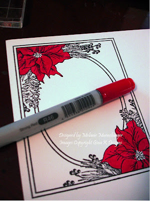
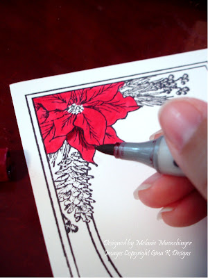
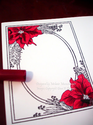
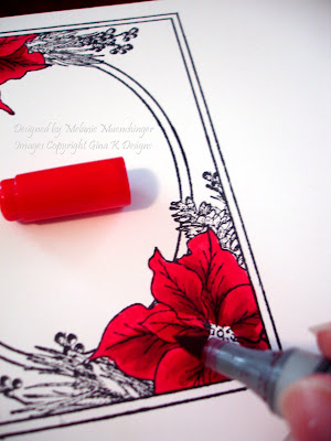
I've had lots of wonderful feedback as well requests for coloring the poinsettias in "Festive Frame": although I don't have a video, my process of just 4-5 steps for these is so simple, a few pictures ought to do! :) I don't use the Colorless blender very much when I'm coloring (for me it's mainly for taking away boo boos or just when I ended up putting on waaaay too much color than I should have), preferring to stick with just a few contrasting shades of each color for a lot of "pop". (Blend too much and you can lose the dramatic shadows that really make your images look 3D.) Today's will be using traditional colors.

Color the poinsettias completely with a solid coat of R16 Strong Red (above).

Imagine "the light" coming from "above", and trace along the undersides of each petal with R59 Cardinal where there is one overlapping another, just following the underside of the lines.


Now trace the veins with Cardinal down the centers of the leaves, working from the middle going outward, and small strokes out from these, again just going over the lines. I love the contrast of these two colors, they provide very dramatic shadows and give lots of dimension. (If you like this look, skip the next step. If you want a more blended look, go to step 3.)
Pick up Strong Red again and go over these areas you did with Cardinal, working in the same direction you made the Cardinal strokes. If more blending is desired, go over the lines/areas in small circles. You'll see how these darker lines blend seamlessly into the Strong Red layer.

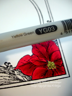
Color in the center with YG03 Yellow Green of other bright, light green.
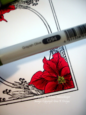
Add a few dots of Greenish Olive or other darker green to the middle and bottom of the center.
That's it! you're done! Trace with a Stardust pen or add Stickles for shimmer if desired.
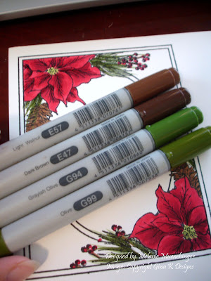
Here are the remaining colors I used for the pine cones and needles. As you can see: I usually only use two shades of a color, and create the other shades i need "in between" by doing tip to tip coloring, (which is picking up the darker color on to the lighter marker and coloring with that, which I'll share this another time) )or as I did in this tutorial just using the lighter color as a blender going over the darker color.

I hope this was helpful! I know you've seen this color combo from me a ton of times with this image, but it's just what goes with stuff I like around my house. ;) To make purple, pink, blue, whatever, just choose a light and dark shade of each and follow the steps above! :)

Stay tuned for a project I am SO excited about using this colored image!! :) Any guesses what I made this time??

Sunday, November 15, 2009

Week 3: Linda Payne

Anybody recognize these gorgeous children from scrapbook pages on STV or see a resemblance to a certain someone's sweet smiling avatar? ;)

You can see Linda added "2008" to the corner, I love this idea of creating a special card to send to a family using their holiday photo from last year! :) What a wonderful surprise to receive that memory of Christmas past... :) The "Festive Frame" is stamped onto pine patterned paper, and she cut out a full sized poinsettia from "A Year of Flowers" embellished with pearls and glitter to accent the bottom and a little Pure Luxury bow at the top to balance the layout. Beautiful photo project, Linda!!


Linda's design details - embossed poinsettia onto Red Rocket that had been misted with Gold Glimmer Mist, paper pieced one poinsetta, used copic R59,R27, E33, black...matted onto stash dp, GKD white, red rocket, and all spruced up, gold mini pearls, gkd ribbon, 2008 from unknown collection peg stamps, nestie scalloped ovals.

Let's go see what else Linda made for us today! :)

Saturday, November 14, 2009

Beautiful Bow!

Here is a large 5" square card, with the only stamping being the greeting from "Festive Frame" on a popped up oval die cut. After I made this luscious double bow with my Bow Easy and some burgundy silk ribbon from Sharon's store, I wanted to keep the rest of the card, really simple, no image required!. The DP is Basic Grey Indian Summer, matted on Pure Luxury Cranberry Tart, perfect match with this ribbon. Base is Pure Luxury White, I embossed this little branch trim on the side, it's a bit hard to see in the pic but is a lovely match with the delicate pattern of the paper. I attached the bow with a glue dot, as well as a cranberry button to the bottom corner from the Autumn Assortment (it looks a bit dark in this pic, but matches both the paper and ribbon very nicely! Last I added an adhesive nailhead to button's middle middle for a bit of bling.

I love how with a few top quality items, "simple" can be so "WOW!"

Have a blessed Sunday!

Oh, PS!! I bet you thought I forgot all about the Bow Easy winner!! The winner of the blog candy from our Festive Frame hop left this comment on Wendy's blog:
Jerusha said...
WOW! This is beautiful. What an amazing idea! I love it!

November 11, 2009 6:59 AM


Congrats Jerusha!! Please send me your addy and I will put your ribbon and Bow Easy in the mail!! :)

Friday, November 13, 2009

First Christmas Blog Hop

Welcome to our "First Christmas" Blog Hop!

Today I used Asela's gingerbread pair to make a cookie wreath. I placed a circle die on my paper to use as a guide on my white CS and then stamped the image 5 times around it leaving a space at the bottom for my bow. After coloring, adding shadows with W-1 Warm Gray Copic and outlining the white piping with a Sakura Clear Glaze Pen, I cut loosely around the outline of the cookies. Next I took a small rectangle punch to make two slits in between each pair to thread my polka dotted ribbon through, I chose this one to go with the little white dots on the cookies. The bow is separate and attached with a glue dot. I stamped "Festive Frame" onto DP, this print has such a homey feel, and colored my borders in tan to match the cookies. Wreath is attached with pop dots, completely covering the oval border, and card base is Pure Luxury White.


Are you ready for some more Eye-Candy tonight!? Stop in at Asela Hopkin's blog (our featured Illustrator tonight) and see what she has prepared for us.

Then, check out these GinaK Designer's blogs for their projects:

as well as our CenterStage Spotlight Designer's blogs:

Remember, the Idea Center has lots of tutorials, photos, and links that will provide even more ideas for you with this stamp set!

And, if you haven't already done so, be sure to leave a comment on GinaK's blog for a chance to win this stamp set tonight too! If you have already purchased this set, you may swap it out for any other GinaK stamp set valued at $23.95.

Gotta Scoot!

I set out to make this primary colored card with the van or RV from "Are We There Yet?" to make my own color blocked Partridge Family inspired vehicle, but in the end just decided it would be easier to use the scooter LOL! I used a red, yellow and blue Copic for my "Inspiration Mosaic" grid, being sure to leave some white space to make the colors pop. The mulitcolored scooter is cut out and popped up. I added a greeting from the set to the grid, as well as a row of silver embossed dots from the "Inspiration Mosaic" set to go with the wheel theme and added a little silver to the handles and rims. I offset two blue mats at the top left and bottom right corners of the Rocket Red card base to give it even more of a funky, pop feel.

Blog hop tonight!!

Thursday, November 12, 2009

Stop to Smell the Roses

Forwarded to me by my stepfather tonight, worth sharing:

Washington, DC Metro Station on a cold January morning in 2007. The man with a violin played six Bach pieces for about 45 minutes. During that time approx. 2 thousand people went through the station, most of them on their way to work. After 3 minutes a middle aged man noticed there was a musician playing. He slowed his pace and stopped for a few seconds and then hurried to meet his schedule.
4 minutes later:
the violinist received his first dollar: a woman threw the money in the hat and, without stopping, continued to walk....
6 minutes:
A young man leaned against the wall to listen to him, then looked at his watch and started to walk again.
10 minutes:
A 3-year old boy stopped but his mother tugged him along hurriedly. The kid stopped to look at the violinist again, but the mother pushed hard and the child continued to walk, turning his head all the time. This action was repeated by several other children. Every parent, without exception, forced their children to move on quickly.
45 minutes:
The musician played continuously. Only 6 people stopped and listened for a short while. About 20 gave money but continued to walk at their normal pace. The man collected a total of $32.

1 hour:
He finished playing and silence took over. No one noticed. No one applauded, nor was there any recognition.
No one knew this, but the violinist was Joshua Bell, one of the greatest musicians in the world. He played one of the most intricate pieces ever written, with a violin worth $3.5 million dollars. Two days before Joshua Bell sold out a theater in Boston where the seats averaged $100.
This is a true story. Joshua Bell playing incognito in the metro station was organized by the Washington Post as part of a social experiment about perception, taste and people's priorities.


The questions raised:
in a common place environment at an inappropriate hour, do we perceive beauty?
Do we stop to appreciate it?
Do we recognize talent in an unexpected context?
One possible conclusion reached from this experiment could be this: If we do not have a moment to stop and listen to one of the best musicians in the world, playing some of the finest music ever written, with one of the most beautiful instruments ever made.... How many other things are we missing?
Life is a gift, enjoy every day...

Wednesday, November 11, 2009

New Release: Calendar Bits & Pieces and Calendar Grid

Thanks for coming out to this special mid month release: Tami Mayberry's " Calendar Bit & Pieces" and "Calendar Grid" sets! The calendar grid is just that: an open grid with the days across the top for you to fill in as you please, the larger set includes all the months, numbers occasions, and little images to go with. I started out making an extra big CARD, measures 5 1/2" x 7 1/2", because I think it makes a fun background not just for calendars. :) The little "I love you" and "24 - 7" are all separate stamps included in the set , I just pieced them together on my block and then stamped the heart in Vivid Brick on every day of the month. A fun and easy Valentine! Cardstock is Pure Luxury White, Black Onyx, and the new Kraft, very excited about this new neutral! Last I added some adhesive nail heads to jazz it up as well as to go with the calendar theme, like it's a page waiting to be torn off to reveal the next.

Next I made a calendar for the month of December. I don't have any binding system, but with 8 1/2" X 11" sheets of Cardstock, here Silver Lining, I can put one month on either side and do a total of 6 sheets. Later you could put these into a scrapbook and add some journalling. I stamped Festive Frame above it to add a photo, this is a black and white print out of the one I shared before. I like the proportions of these two large stamps together and it's perfect to have a place to add a picture above to go with the month! I stamped the frame over my photo this time and cut out the pic and layered it on top this time instead of cutting the window out. White mat measures 6 1/2"x8 3/4" , with the black mat being 1/8" larger on all sides. Something fun to hang this up: I punched a hole with my Cropodile in the top and added an adhesive rhinestone to the head of my clear pushpin, I'm going to start doing this to all my pins! :)
Gina will be showing an easy way to stamp the numbers into the spaces you need for the particular month, here I actually left all mine together, 1-31, as one stamp (no cutting) and just inked up everything to the right and below "1" and stamped into place, then cleaned my stamp and inked up the remaining rows to put on Sunday and Monday. Pretty simple!

The Menorah and Christmas tree are also part of the set, it's fun to stamp these and the other holiday images over the proper days. The month "December" fits in the small oval punch, and I layered it with a large one colored with C-3 Copic, which I also used to color the borders on my frame.
Last I made a perpetual calendar with all the numbers, plus some images, stamped on white and punched with a 1/2" circle then adhered to flat marbles with some Crystal Lacquer. I added a little strip of adhesive magnet tape to the back of each, now they are ready for the fridge, but not quite so strong that they want to stick through CS. the solution I came up with was to stamp the calendar in StazOn onto a clear envelope I had and cutting of the adhesive strip on the end. Now I have a clear pouch that I can slide a piece of patterned paper into corresponding with the month or season. Kids (and this big kid!) love perpetual calendars, it's always fun to be the one to get to set up the new month and change the days, adding in birthdays and holidays. My older son came in while I was making this so he set to work stamping out all the other images I hadn't already done, he's a little "magnet crazy" now!


And here we have February as another example. As you can see the size of the marbles are a little bigger than the squares of the grid, however, you don't really notice this gap when they are all applied, you just see the days going in order and what is important is that they match up with the size of the days going across, which they do! yay! (whew!) ;)


For some helpful tips on how to use the Calendar Bits & Pieces and Calendar Grid stamp sets, please be sure to check out Gina's blog and StampTV for a helpful video on just how quick and easy it can be to use! Both of these sets as well as the PDF version of the Calendar Grid image will be available for purchase tonight over on our online store.

After that, stop by our Illustrator's blog - Tami Mayberry for some projects with her timely stamp sets.

Here are the Gina K Designer Member's links who are joining us in the preview tonight:


You'll also want to check in on these CenterStage Spotlight Designer's blogs for more ideas:


Tuesday, November 10, 2009

"Festive Frame" Blog Hop!

Welcome to our "Festive Frame" hop! Today I am sharing a card and gifts using the frame. What you see below I am unofficially calling the "Grandparents Card": it is worth the extra time to make a card with extra panels for these special people, they are sure to appreciate it and have it on display probably all year long! :)
You'll need one 8 1/2" x 11" sheet of Pure Luxury White CS,( stamping the frame into all four corners and cutting), and 1 and a half sheets of Pure Luxury Fresh Asparagus CS, cut and score to make 3 side-folded A2 sized cards. The third card is what's adhered to the back right and left sides of the other two cards to create the accordion. I'm showing a second view of the same card so you can see how it can be "mountain" folded, like an "M" in the card above, or "valley" folded like a "W" below. You could also bring both ends around in a kind of semicircle to frame up a little candle or something in the middle. :)
I chose to photograph it on our coffee table not only because it's extra long (but still folds up to A2 size!) , but it would be beautiful displayed on a bookshelf or here as a centerpiece, if you had a little more time you could also decorate the backside with four more frames showing Christmas memories. TIP: to cut down the time of this project, stamp the frame in color on white or emboss on colored CS and skip the coloring! This accordion is something I would be happy to make for myself for our family to enjoy every year, like a mini scrapbook so to speak. These are my two sons' school pics, along with greetings from the set, but with your printer or alphabet set you could add names, dates, stamped holiday images, or two more photos in the panels in between. I added some Cranberry Tart Large Punched Flourishes and adhesive nail heads to the corners and flower centers.

You can see in the closeup the sparkle on the images, I used the Sakura Galaxy Glitter Pens. I've long been a fan of their Stardust Pen, but just got these colored ones, and I am so pleased with the results! While they may not always be an exact match for your colors or cardstock, when you apply then tone on tone, like the golden pen over the Mignonette Copic in the flowers and lime pen over the Verdigris Copic above, or the rose pen on the Cardinal Copic below, they blend beautifully but the glitter still really pops!

I did not use any additional papers to mat the frames, all the different "borders" you see are just the images colored with markers!

My next projects use the waterproof labels Gina K sells. These HUGE 3 1/3"x4" labels are a steal at only 43 cents a project (you get 30 labels for 12.95!) You don't need special inks, all your stamping and coloring are preserved, even if it gets wet! If your packaging already has a label on it, you can soak it off in a few minutes with some water and then dry before applying your new one. On both of these I stamped the frame in Memento Tuxedo Black onto the labels (before applying them to the bottles LOL!) and colored them with Copics. Now I have beautiful, handstamped labels to dress up these gifts and don't need any additional papers, adhesives or embellishments (except maybe some ribbon, I'll get to that in a minute!).
Here is a closeup of the wine label, I rubbed the Antique Linen Distressing Pad all over it to give it this beautiful yellowed patina, and then stamped the crackle image from Bold Flowers all over it in Tuscan Tan, perfect for an elegant and aged-looking wine label, isn't that gorgeous?? TIP: I stuck with just greetings from the "Festive Frame" set today, but try personalize the oval window by adding the date ("2009, a very good year!"), a monogram, your family's name, etc! As you can see, the label is slightly smaller than the stamp image, but you do get the window in its entirety and corners clusters, the only thing that's missing is the outside frame...still looks like it was made for it!

A bottle of wine makes such a wonderful housewarming or hostess gift (or "emergency gift" for someone who drops by with something when you forgot them on the Christmas list! (not that I've ever done that...!)), and with this festive label, after the wine has been enjoyed the bottle can stay out on a counter dressing up the kitchen or dining area, or made into a candle holder or oil lamp and serve as a happy memory of holidays past...

I found this large vanilla jar candle at HEB, they had an assortment of holiday scents for only $3.98 each, but you can find similar ones just about anywhere. After stamping and coloring the image, I colored the oval with Lionet Gold Copic and stamped the music score from Nina's Vintage Borders in Antique Linen Distressing Ink over the whole label. I also rubbed a little of the gold Metallic Rub On Paste over the corners. This time I mounted the label horizontally to fit the jar. The gold lined organdy white ribbon is from Gina K Designs, and I made both of the bows you see in this post with the Bow Easy.


Jar candles like these make perfect gifts for friends or teachers, with their extra long burn time they can enjoyed over and over and the label outside will look just as pretty once the candle is gone. BONUS gift: The remaining wax inside can be popped out and the clean jar repurposed for holding candy etc! I hope these labels inspire you to explore the many gift giving possibilities for these Festive Frame labels, they would be just as perfect on a tin of cocoa, jar of bath salts, or store bought or homemade preserves, and as I mentioned before, with an alphabet set you could add "Mom's Jelly", "Snowman Soup" etc to the frame!


Today I'm giving away a Bow Easy and assortment of handpicked holiday ribbons ! I will draw a winner randomly from one of the blogs in our hop tonight, so be generous with your comments if you'd like one, you'll be ready to start making festive bows for projects like these right away! :)


I've invited a couple of friends to join in on the blog hop tonight, so please click on their blog links to see the projects they've created for us:
Then, check in on these GinaK Designer's participating in the Blog Hop tonight:

Carolyn King
Donna Baker
Erika Martin
Jessica Fick
Lee Murphy
Theresa Momber

And our fabulous Center Stage Spotlight Team:
Deb Felts
Diana S. Queen
Melissa Cash
Sharri Seffens

After you're done hopping to all the Designer's blogs stop by GinaK's Idea Center here: Festive Frame for lots more ideas on how to use the Festive Frame stamp set. And, don't forget to check in on GinaK's blog so you can leave your comment to be entered as a chance to win this stamp set, too!