Friday, October 31, 2008

Sunny Simplicity

This was a very simple card, but I love how the simplicity of the rest of the card makes the sunflower go "BAM!" I stamped it in Basic Brown in the middle of an "Alli medallion", then colored with my peerless watercolors. Sorry, no step by step pics when I colored this one, (I'll do another) but I went over the whole thing with Brillant Yellow, then dabbed in Orange Yellow to the back row of petal and the top row, close to the center, then pulling out toward the edge to blend. Both browns in the pad were used for the middle, and I concentrated my darker color to the lower left. For a shadow casting off the flower's center, I added just a bit of green around the left side, then outlined the whole flower with my Prismacolor Warm Grey 20% marker. I love that tiny bit of Leafy Branch at the bottom, and the tied olive ribbon just screams big old leafy stem!

Happy Halloween! (yesterday was crazy and I did NOT get our Halloween favors photographed; that's okay, we had fun making them , but they weren't going to win any prizes!) Be safe tonight!

Thursday, October 30, 2008

Think PINK

Well, I am really sorry I missed out on 30 days of promoting Breast Cancer Awareness with project samples this month, but it's a cause to support year-round so here goes! I made these for a Little Tees Swap on SCS, should be getting my swaps in the mail some time next week, I'll be sure to take pics of what I receive!
It's a very simple design, but with this classic white tee as the focal point I liked this design better than any of the other more complicated layouts or added colors I was trying out before deciding on this (and I'm very happy with it!) The tee outline and cause ribbon from the "Little Tees" set were stamped in Memento Tuxedo Black on white CS, colored with Blush and Peach Copics (finally bought a WHOLE box, A, expect a post later about how I decided on this one!) and outlined with my Prismacolor Warm Gray 20% marker to give it a nice curvy shape (and "support the girls"!)
I mounted it on a Scalloped Rectangle Nestabilitie die cut in different prints from the SU! Designer Series pack and made my own little ribbon with a loop of SU! 1/4"grosgrain, glue dots and a self adhesive rhinestone. "Get well soon"(I love this greeting and font, it goes with everything!) is from "Say it with Flowers". I hope the swappers like it!!
Don't forget to scroll down and read the guest designer post! Have a great day! Only one more day til Halloween, are you ready?! (I'm not!)

Guest Designer: Week 4

Another week of "Wow!!!" from Theresa Momber, she created another beautiful framed piece and card to go with (love how she used that wide brown base layer to mimic the frame). I adore how she made the leaves growing out beyond the border, and how she sponged that spectrum-looking background to create a sun-kissed hillside! (Please take me there, NOW!! LOL!)
Here are Theresa's tips for creating this project: "To get the color on the sunflowers more intense, I used a yellow craft marker on the upper petals and an orange one on the lower petals. Then I used Koh-i-noor pencils (blended with OMS) over that to get some color variation. The images were all cut out and layered over the sponged background. There is a little hint of a foliage stamp from Botanical Dreams in the background. The green layer is Kiwi Kiss from SU. The card base is Chocolate Chip. I found the frame at Walmart for $3. "

One more thing I have to share, another direct quote from Theresa's email to me:
"When I started on my projects this weekend, I was looking to see which flowers I hadn't used yet and discovered I have used them all, at least once. Wow! That says something about the usability of A Year of Flowers. I think it will be a "bread and butter" type of set, like Lovely as a Tree by SU."
Weeeell, I like the sound of that! ;)
Our next release is not until the 13th, so guess what? It's a long month and you will be treated to a 5th week with her next Thursday, hip hip hurray!
Now please head over to Theresa's blog for another fabulous project! :) I will have one more post today, I can't believe I went almost all month and didn't share a card in honor of Breast Cancer Awareness, where did October go?? (and then Friday, a Halloween project would be appropriate, don't you think??)

Wednesday, October 29, 2008

Ambrosia Flowers


I'm been so focused on my watercolors and single layers lately, I've forgotten all about putting my "Year of Flowers" with DP for you! So here's a card which one of my "most favoritest" papers from the Basic Grey Ambrosia pack (I'd have a whole outfit made from this print if I could!), I love the way these flowers look with the swirls and flourishes in the paper! I stamped them in Basic Gray ink (masking one flower) to match my paper (I adore this color combo!!), and then colored them with them warm matching hues in my Peerless pad. Now click on the pic: see the distressed look of the paper I stamped my flowers on? I am happy to report I used one of the "solid" color papers from this pack to stamp on and the colors blended on it like a dream, no pilling! And I didn't have to age the paper it looks like some gorgeous old tile or fresco wall, I love it!!

I don't have a Basic Gray marker, so I traced a square border around them with my Nestie die and a pencil (good match), making my border smaller than my layout to have one frilly bloom spilling out over onto my pattern. Mat and base is Ruby Red. I just love this "square on a square" layout, so simple, so elegant. Tip: All borders are 1/8" on this, my favorite size for a border. I typically keep the sizes consistent for all layers on my card, unless there is a layer I really want to draw attention to, in which case I'd make it bigger, or one layer to recede, then it'd be smaller...) The finished card measures 5X5, so I'll need to put this one in a large envelope*

Have a glorious day!!!


*I don't think I can part with this card actually, it just makes me happy...(unless someone wants to publish it that is, then I will happily mail it out LOL!!)

Tuesday, October 28, 2008

The Magic of Vellum

I've been wanting this deer and sleigh to hook up all month! ;)
There are several ways to reverse the sleigh, but here I'm using vellum paper (not the thicker vellum CS). Stamp your sleigh in Memento Ink (Tuxedo Black).
Now turn it over. It is important you color on the opposite side from which you stamped, otherwise your Copics will remove your stamped lines(even with a fast drying ink)! Copics don't blend the same way on vellum as they do on CS, so you may have some streaks if you apply it heavily.
I'd planned on covering the whole mat with the vellum, but then decided just to trim the sleigh out. I mounted it using glue dots(strategically hidden underneath my self adhesive rhinestones on top and just a touch of the Quickie Glue pen on the delicate areas.
The greeting on the Nestie tag die cut is embossed with Gold EP to match my Gold Cord reins (also attached with the Quickie Glue Pen) I added some Real Red Large Flourish punches that go so nicely with those antlers and "blinged" these and my punches up with rhinestones, too.

I love how festive this card turned out!

*I almost added to the inside"Does this make me look too hippy?"... But didn't.

Monday, October 27, 2008

With the Angels

This will be a short, I just have to let those of you who have been praying for Marcus and following his story know that his Aunt Nancy emailed today to say he passed away Sunday morning, shortly after I posted. His family is grieving but are thankful his suffering is over, this past week he was in a tremendous amount of pain.
This is a picture Nancy sent me of Marcus and her daughter Jessica (his cousin) last year at Thanksgiving (and the last time they would see each other). He'd been fighting cancer for about a year at that time. As you can see, he looks very different here from his previous pics.
Marcus's family is so grateful to everyone who has reached out in prayer and offered their support in different ways, they say they can FEEL the love and it IS helping. If you were someone who linked the Marcus post, I would love to know, as they and I have been trying to visit your blogs and offer thanks, please just leave a comment here, I'm sure I've missed a few. (It has been just amazing to see it spreading by degrees, from blog to blog, friend to friend, even across oceans...) Links for Karen his mother, and Nancy are in the posts below if you have time to visit, forgive me for not adding all the links right now.
I would like to say more but it's all I can manage for now. I am thankful I already have several posts saved and scheduled so there will be projects every day to share here, please keep checking back and thanks as always for stopping by.

It's Easy Being Green...

I had been meaning to try some buttons in the center of these Gerbera daisys from my set at some point, by that I mean the kind you sew on, (the center is just the right size)

but then I saw these adorable PINS at the Target Dollar Spot, and knew just what I wanted to make!! 9 on a sheet makes those some pretty hot/cool bling at only 12 cents each!! (they had another sheet, too, just as cute, with 9 completely different designs) You can make two holes through your card to thread the pin through so the recipient can detach it, or here I just attached it with a pop up glue got (the big ones). Target had all sorts of other fun "Green-themed" items there (notepads, bandanas and such) so I picked up a few to put together a little grab bag for her, I just think these are super cute to put on cards or pages or to give to your kids or crafty earth-lovin' friends! and on this daisy (I also think "Peace!" when I see daisys) it's a super cute, super simple "green" design! :) Flower is stamped on PT Vintage Cream CS*, in Old Olive ink with SU! 1/4" ribbon to match, cut a slit under the the flower and thread your ribbon through to knot, easy peasy!! (I love how fresh this daisy looks in green, reminds me of sweet limes, cucumbers, and other good stuff) :)

I made this card with my friend Joanne Basile in mind, if you read her blog you know she does a post on "Going Green" every week. She just had a birthday, so please go leave her some love!! :)

(*come to think of it, recycled paper probably would have been a better choice...LOL! Sorry, Joanne!)

Saturday, October 25, 2008

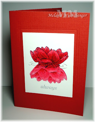
Reflecting...

This is a simple reflection technique that you don't need a reversing stamp or brayer for!
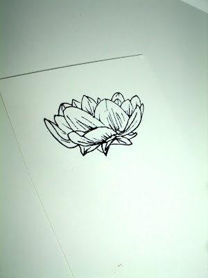
Simply stamp the flower (here in Basic Gray) at the top half of your mat.
Now mask it with a trimmed bloom, and without reinking your stamp, turn it upside down, overlap it just a bit with flower above it and stamp.
Remove the mask to reveal the reflection! This one will be lighter since you didn't reink, perfect for a reflection. If you look carefully it is not an exact reflection of the same petals above, but it's symmetrical enough that no one will (should) notice. :) (It is missing a few lines in the lower image because I took my hand off the stamps to photograph it, these step by step pics are staged, did them after the first card)

Now, to color! I wanted the blooms to look very similar, but the top one to be more vivid. I used only three Copics on this card. I started with the "real" flower coloring one layer of Red Cadmium Copic, the reflection with one layer of Coral Copic. Next I went back with my Red Cadmium and really got into those areas that need shadows on the real flower, and then just did a few strokes on each petal on the reflection in the same areas. I blended these in on the reflection by going over them with the Coral Copic. Last I used my my Colorless blender on both images at just the tips to highlight. NOW: to add water! I was stuck here for a moment deciding how I wanted to approach it. I really wanted to keep the focus on the flowers instead of the colors of the water, and when you see a reflection like this, you're really not seeing water colors, but sky or sometimes even "black" depending on if you're surrounded by trees, KWIM? In the end, I chose to add a few small ripples with my gray pencil, kind of disconnected ovals to create the illusion, similar to looking at pure water in a vase. I just LOVE how it turned out (not to mention how easy it was, once I made up my mind!) "always" from "Say it With Flowers" is Basic Gray ink, but I stamped off first before adding it to match my reflection. Doesn't it give the word such a "quiet" feel? I embossed a simple rectangle onto my textrued DCWV CS base.
I'll be changing up this design again and again with colors and layouts because I'm just crazy about the look! If you try this out, please let me know by linking your creation here, I'd love to see what you'd do!

On a personal note: I started out making this card for Cammie's Land Cruise Water Challenge, but as I worked, decided I would be sending it to the Russell family. (Thank you again everyone who has been sending their RAKS and prayers!) I got a little philosophical and thinking about what I wanted the finished artwork to convey, and remembered reading on Karen's blog Marcus talking about work he had to do on "the other side", which made me "reflect" on this reflection. I thought about how perfect and close God's love and presence is to us, and how close our loved ones are (in our hearts and memories, perfectly preserved in time) even after they've passed over... It's not a perfect metaphor, of course (since a reflection disappears if you have no light, and God is always present), but anyway, for what's it worth...
Here is an excerpt from his mother Karen's blog a few days ago:


"He is slurring more, but still has his sense of humor. His vision is so bad, all he sees in double vision. He has talked a little about going on his "Mission" to help others on the other side. He is on a lot of steroids so his face is swelling more and more, plus they give him other side effects like irritability and joint pain. But he doesn't complain much. He listens to the Mormon Tabernacle Choir a lot and quoted to me the words from "Come Come Ye Saints" last night. He is a pillar of strength to me and those around us. He is my Marcus, even in that swollen face, I see those eyes that stare right through to my soul."

...and from yesterday:

"He really is deteriorating fast. We are pretty sure that he could "go" at anytime now. He is so week, unable to see or even speak much. His breathing is getting more and more erratic and his pulse is fast and unstable. He has been in more pain, so we are adjusting his meds to keep him more comfortable. He mostly sleeps, he doesn't eat and only has very few fluids since he can't swallow much. We are just praying that he goes quickly so he doesn't suffer. Thanks to all those who are getting Marcus's name out there for good thoughts and prayers. Thanks for all the well wishes, comments and prayers you have left here and on his carepage. It is so wonderful to see how many love and care for us and especially Marcus."

I wanted to post their address again and let you know the names of the rest of his family, as they need prayers, RAKS and support, too: John-his father, brothers- Aaron, age 14, Noah, age 9 and Jackson, age 6, all pictured above in a family portrait taken last month. (I watched my own boys today sharing a moment of brotherly love and almost burst into tears thinking about what Marcus's brothers are going through!)

The Russell Family
100 W. 500 S
Providence, UT 84332

Karen's sister Nancy will be unable to attend the funeral because her daughter Jessica is having serious medical problems. I am praying for them too as they grieve for their family and deal with being away and with Jessica's injury.
Thank you for reading, have a blessed Sunday, hug your loved ones tight!

Cozy Country Church

For this card, I wanted it to look like someone was peeping through the fir branches at a little chapel in the woods. I stamped the pine needles from "Winter Foliage" (the Free with Three Set) in Handsome Hunter onto my base and onto the top corner of fmy focal point mat (which is mounted on Hunter Green and Real Red CS. Asela's "Christmas Blessings" image is colored with Copics and outlined with Stardust Stickles. I also drew some lines down from the roof with the glitter to make icicles. Ribbon is Gina K's Pure Luxury Holiday Assortment and silver frame is SU! Hodge podge.

I am happy to report it is a little bit colder here in Texas! (just a little bit)

Friday, October 24, 2008

Feathered Friend*

The inspiration for today's project was this terrific tee from Target, I wanted to make a special matching card to go with it! (Hey, I have owl stamps!)

I really like those little feathers in the design that spell out "Trick or Treat", and saw how easily I could add a few rows to my card with my SU! large oval punch. You will need 8 punched ovals for this card: 4 Pumpkin Pie, 4 Old Olive. Cut your ovals in half, you can save time and cut through three or four with your rockin Tim Holz Scissors.
Now ruin a strip of Dot n Roller across your Chocolate Chip base. Begin in the middle with one feather and work outward so the edges will be even and you don't have a whole feather on one end and skinny feather on the other. Add more adhesive and two more rows, centering each new feather in between two below it. Layer them low enough to cover little gaps in between. The great thing about this adhesive it rubs easily off if you have extra, but I just covered mine with 5/8" Chocolate grosgrain(which makes it look extra purty and covers the bgaps in my top row), the adhesive also held my ribbon in place!
Last I added my "Owl Always Love You" owls, colored with Koh-i-Noors and cut with a circle Nestie. I kept my shading simple since the shirt was so graphic looking.
I just love the texture this adds, and it looks like a lot more work than it was, doesn't it? You'll see I left room at the bottom for my greeting, stamped in Basic Brown, and used a corner rounder on my base. I am popping these in the mail for a special someone who surprised me last week with some fun mail! Hope she likes them! Have a great weekend!!

*I, unlike some, chose NOT to use "Hooters" in the title to boost my ratings! ;) just kidding, you know who!!! :) (love you, Carolyn!!)

Thursday, October 23, 2008

Guest Designer: Week 3

Week 3 with Theresa, and that girl has been busy! (I have NO IDEA why blogger uploaded these pics in reverse order, but let's go with it, shall we??) She made this beautiful ornament with my poinsettia this time, complete with gift box and a matching card, can you say, "WOW!"???
Here's a close up of the ornament, which she colored with Sharpies, and highlighted with a coloreless blender after it dried. Doesn't it look fabulous??
And this was just a $1 ornament she picked up at Michael's, stamped with Stazon!! (Gotta go to Michael's now!)

She altered a necklace-sized jewelry box, also from Michael's, to hold the ornament. The poinsettia is colored this time with Koh-i-Noors., a red marker to add a little more depth, and Gold EP in the center. Background is done with Paisley CB folder inked with Certainly Celery for the "Negative Effect".

Here you can see she stamped out three poinsettias to create this layered look. Thanks, Theresa for sharing which leaves to color on each layer to save time! (Theresa also pointed out that the single line sentiments from both flower sets fit the word window punch!)

Well, I'M inspired now! how 'bout you? Let's go see what else she made for us today! (she peeked it to me last night and it's my favorite projects of hers yet!!)
(Thanks everyone who attended the land cruise party, I will be posting my challenges samples I made for it with details on creating them soon, please stop back by! :)

PS I have so many things to post, one of the few times there aren't enough days to put everything up that I need to instead of the other way around! RAKs I've gotten (thank you!!) , samples, tutorials, etc!! It's coming, it's coming!!

Wednesday, October 22, 2008

Special Delivery!

Brighten someone's day (and their desk) with this sweet little flower pot shaped card!


I wanted the flowers coming off the top of my card, but I needed a flat spot across the top for folding, so I cut this CS down to 10 inches and scored at 5" and folded. This gives my a half inch at the top to attach another sunflower. Stamp some flowers in a bunch on the top half of the front, masking and adding leaves as needed, and stamp one part way of the edge to cover with your cut bloom.
Now draw a simple pot to the bottom edge( or make it fancy, or make it simpler and just draw a stright line if you want! Remember you'll be cutting it out, so if you don't like your first effort, you can try again, going inside those first line you made, they'll get cut off! For best results, use pencil :) Fold card, and cut through both layers around the flowers and pot.
Color the front and stamp, then color (I used the Peerless watercolors again) and cut more blossoms to layer onto the card with dimensionals. See top pic for finished card! (Sorry I didn't do more step-by-step coloring pics on this one, I was kind of in a hurry, (and it wasn't my best work!) but it still turned out pretty cute, I think.) :)

Our land cruise party is tonight 7-10 PM CST (aw, heck we might be partying even later!), hope you'll join us for fun and a special one day only coupon code when shopping at Gina K Designs!!

Have a glorious day! (if you have time, send someone flowers!) ;)

PS Mel does it again, go check out today's EMROIDERED daisy!!! (Tomorrow, to-die-for ornaments from Theresa!!)

Tuesday, October 21, 2008

Tole Rose Tutorial

White and Ivory are just so chic together, aren't they? Instead of coloring, I was thinking how soft and beautiful the rose stamped on vanilla paper would be on a pure white background....

A few other things I did differently from my previous rose samples (hee hee!): stamped the rose in Basic Gray ink instead of black, which really softens the look. (You can also do this to make your drawing look more like a pencil sketch on your cards.) Also, instead of shading with color, I pulled out my Versamarker and really got into those areas I needed shading with the brush tip, now I have subtle, creamy shadows! So this is a great way to get fast tone-on-tone shading. Now roses are some of the best flowers for the paper tole technique: here's a pic that shows how I stamped two roses, but made three layers by cutting out the top and the bottom to layer under and over the whole rose instead of having to stamp and cut a third time. They are numbered to show what order to layer them on your mat, sandwiching dimensionals in between to really make it 3D.
I chose to line them up perfectly with the image below, which you usually do in tole, but I experimented before adhering them all and saw it looks super frothy to place them at angles, not matching up with the image, you get more petals that way, like a double bloom variety! (I'll post one like that another time)
Here's a side view of the card top show the dimension, I curled the leaves (painted with Old Olive and an Aquapainter) out a little with my fingers, just attaching them at the base. I also added a little Leafy Branch Cuttlebugging to the bottom and my new Ivory 5/8" grosgrain (it looks a little yellow in this pic). The mat underneath my Nestabilitie die cut is Basic Gray to match the ink. Quote is from "Say it With Flowers".


(Originally I was going to mount it in the center of a vertical A2 card, but I saw it had a smudge on it, so I just scored a 7 inch scrap I had on my desk in half and made it into a tent topper! I like the unexpectedness of that in the design also, nice proportions, no? (happy accident!)


Go check out some amazingly beautiful creations with these sets by the amazing Melissa McCarthy, I just love that gal and her stuff! Have a beautiful day!

Monday, October 20, 2008

Ladybug, ladybug...

It's been over two weeks since our last release and I've yet to show my ladybugs, how did I let this happen?


Here's a closeup showing all three 'bugs moseyin' along on the Cuttlebog embossed Leafy Branch, stamped in Memento Ink, colored with Red Cadmium Copic and covered with Crystal Lacquer, which makes it somewhat difficult to photograph because of the shine fom the lacquer but they are a bright red underneath). The three different angles of the bugs allow for nice groupings and the ability to place one in your composition wherever it needs a little somethin' ("bug embellishment"? LOL!) As you can see one is crawling on the edge of the leaf, one is plunked in the middle, and one stamped on the bottom looks like it's about to walk right out of the frame! I stamped "just because" from "Say it With Flowers" and decided to center it at an angle under my square Hodgepodge frame. I haven't used the square frames that much because it's harder to find greetings to fit, but I'm liking it slanted this way and it gives me more room! Dotted ribbon is from the Pure Luxury Holiday collection, adhesive rhinestones look like brads this way, also from Gina K Designs. Had to repeat my spot pattern one last time with the Threading Water Punch down the side...


The "land cruise" is just a few days away, you won't want to miss all the good times and goodies going on in our forum Wednesday night, please come!


If you missed my post this morning, please scroll down to read, thank you SO much to everyone who has been sharing the info about Marcus on their blogs and spreading the word/praying!! :)

Sunday, October 19, 2008

Grace Under Pressure: Prayer and RAK request


One morning after being woken by my son at 2 AM I stumbled in to my computer and saw I'd just gotten a comment from "Nancy". I hopped over to her blog "Are We having Fun Yet?" after reading in her comment she had a terminally ill daughter to learn a little more about Nancy and from what illness her daughter Jessica suffered. Three hours later, I was still reading: the stories, pain, struggles, humor and joy she shared so candidly about her daily life and her amazing family completely captivated me, she is courageous, witty, and takes nothing for granted. They get through each day through their love for each other and their faith in the Lord, they are just amazing. I am going to be posting more about Nancy and her daughter later as they have some new medical issues they are dealing with, but the really pressing request for prayers today is for Nancy's nephew, Marcus.

Tragically, Nancy’s sister Karen, has a son Marcus (Nancy’s nephew and Jessica’s cousin) who is also terminally ill, with cancer. You can read more about Karen, Marcus’s recent Make a Wish trip to Pearl Harbor, and see pictures they just had taken of their lovely family on Karen’s blog “I Made it Through Another Day”. My original intent was to ask you to send cards to lift up the lot of them: Nancy, her family, Jessica, Karen and her family and Marcus. Recently, however, Marcus is not responding to chemo, hospice has been called. It is difficult to summarize in one post the depth of their pain right now and their need for prayers and support more than ever.


Marcus Russell is 17, and has been battling brain cancer for 2 years. He was diagnosed on Oct. 2nd of 2006 with a brain tumor and had surgery to remove it the very next day. He underwent chemo and radiation treatment and did quite well during that time. Marcus has been very active in marching band and church. His family, friends and community have been very supportive of him. While on his Make A Wish trip in Hawaii in August, Marcus became very ill and it was then that they found a new tumor. Within a couple of week's time he developed multiple tumors throughout his brain. He started a brand new chemo treatment (which made him quite sick) and this last week the MRI showed that it wasn't working. He has already become blind and is now unable to walk. They've been told he only has days left.

When I asked Nancy what they needed, she said: “Just asking for prayers would be awesome. Prayers really do help. Back when we placed Jessica into hospice I got so many emails with good thoughts, prayers and love that I knew I would be okay. I also knew that God heard each and every prayer and those who offered up the prayers were also blessed.”

Your prayers and RAKs would be amazing. I had one other idea that you might be able to help with: If you are able, would you consider putting Marcus's pic and part of this post on your blog? Can we let others know who he is, that he was here? When Karen asked Marcus what he would like the world to know about him and he said, "I am the dark night - I am batman". (When you read their blogs, you'll see they are always ready to lighten the mood with a joke, no matter the circumstances) Nancy says: "He is a man of few words and he doesn't even want to think about what to say. (But they were excited about this idea of posting his pic and gave it their blessing) "BTW, Marcus has always been a fan of batman and a WWII buff. (Family) recently took Marcus to an air force base and the airman presented Marcus with a helmet and other things. They were impressed with Marcus's knowledge of the jets and he even knew all about a new one that will be available next year."
You can also leave comments for the family and get updates at: http://www.carepage.com/ (set up an account and then click on "visit a carepage".... enter "marcusrussell" no spaces - and it will take you to it)

Here is an address for RAKs (they gave permission to list it here)
I Made it Through Another Day
http://lagorda67.blogspot.com/
Karen's address is:
Karen Russell or Marcus Russell
100 W. 500 S
Providence, UT 84332
My heart just breaks for them all, this post doesn't begin to do their story justice, but I wanted to be able to do something. I'm praying they all feel God's presence with them now and His comfort and love (and maybe, even a miracle.)
God bless, thank you for reading.

DIY Coneflowers

I love this daisy, but I'm excited to change it up every once in a while by inking up just the center and petals below it (here with a journaler so it doesn't bleed when I do my watercoloring)
... to create coneflowers! I went back in with my Peerless Watercolors on watercolor paper, using a little Sepia Brown on the center and Wisteria Purple on the petals. As you can see I worked quickly and a bit sloppily to give it a more painterly look. "You're in my prayers" is from "Say it With Flowers".

I don't know WHY my ribbon looks so dark here, but it's Artichoke to match the Always Artichoke layer under the watercolor paper. Lavender Lace is my other color CS, a nice match for that purple when it's this diluted. EDITED TO ADD: To paint some easy blades of grass, start at the bottom with your brush and give it a quick pull UP. This will make it thick at the bottom and thin at the top. :)

I hope you enjoy this easy option when inking up your flowers! Any other varieties hiding in the set... ? We'll see! Thanks for stopping by!

Saturday, October 18, 2008

Poinsettias Cubed

Asela's poinsettias make me think of color blocking with the divided leaves so I thought I'd create a color block/stained glass window look by framing a few with an outline (great way to vary the look of your stamps with a shaped frame as though it's part of the stamped image!) and some simple coloring. I only matted it once on Ruby red before attaching it to my base, but doesn't that outline make it look like I've got 4 or 5??


I started tracing the inside of my Classic Square Nestabilite die with a pen (using a similar width as the line in the image, this is an .03 milimeter Prismacolor)
Netx I masked in three posinsettias and colored the leaves with Copics, Red Cadmium, Coral and Yellow Green for the centers. I really liked the "sleekness" of the finished card above, but decided I'd try some Cuttlebugging with Floral Screen through both layers to give it a textured glass or quilted look, shown below.
I like 'em both, but prefer the top, I'm kind of into simpler-looking things lately), but really appreciate all the work it looks like you must have done when embossing a pattern over a colored image like this! ;) Love that Cuttlebug!!

Friday, October 17, 2008

Flake in a Flash!

This minimal card was made using the Star Nestabilites, that I just had to have, but haven't used much yet, because while I'm very glad to have the capapbility to cut and emboss large and small stars, they lend themselves to certain types of cards, KWIM? So I was trying to think out of the box about some different ways to use therse stars... and stamping with Rupa's snowflakes the other day gave me an idea: may I present to you, the STARBURST!!


I love how these two 5 point stars when layered create this really intricate-looking pattern!!

Start embossing one star die, choose the size you want. After removing the die, turn the die so that the points now line up in the middle of each star arm, as shown above, and emboss. You can create some different nested looks by varying the size of the star die for your second (or even third layers) but here I used the same one. Because they are offset, you must emboss one die at a time, do not attempt to stack them like this and roll through together!! I stamped a single snowflake in the middle in Handsome Hunter with one adhesive rhinestone in the middle and wrapped my matching Gina K Pure Luxury Ribbon around , ta da!! How's that for simple elegance?!
I decided to add a kicked up version with two punched fancy corners (bejeweled with one rhinestone each to match the flake) My husband actually really liked both, which is saying something, 5 thousand cards later, he's a bit numb to them all now! For him, usually the plainer the better, but he also liked it with the punched corners...) Which do you prefer?

Have a great weekend!

Thursday, October 16, 2008

Guest Designer: Week 2


Aren't these day lilies beautiful with the "Theresa treatment"? I love the masking she did here and composition of the two, as if one is being cradled by the other, isn't that sweet? (Typically odd numbered groupings work best, but when done just right, like this, you can really make some magic happen!! Changing the height and angle of each flower and the leaves pointing off in different directions the way she did make this nice looking triangle for your eye to follow, fantastic!!) As usual, Theresa's colors, layout and details all just make such an elegant card. Sigh! ;) Theresa has another project for us today, let's go see! (I hadn't seen it yet upon writing thi s post to peek, but I know it'll be WOW!) AND, don't miss this way cool tutorial she did on Tuesday, talk about a gorgeous silhouette!!)

Now I have a little secret, I've called in a few other people this month to design (not because Theresa can't fill the role, of course!) but because everybody loves flowers so I knew some other designers would really enjoy rocking this set! I had to give two shout outs today because they both posted some real eye candy Wednesday: both are my fellow Dirty Dozen Alumni, one I've become familiar with recently, as she finishes up her 6 month stint as a Dirty Girl this month, Joan Ervin! Her coloring is just divine and she is brand new to blogging, so be sure to go add her to you list of favorite places to visit for inspiration! Prepare to be blown away by this stunning bouquet of flowers (and all that cutting? oh my!), my eye doesn't know where to look, each bloom is so glorious and competing for my attention!


The next designer I actually had the pleasure of meeting at CHA this summer and was a little starstruck to be honest (and doubted she would even know who I was) because I have been a fan of hers for a long time, she's just one of my all-time faves: Meg Shumaker, aka WAXYO! Meg doesn't blog, so I recommend you bookmark her drool-worthy Splitcoast gallery if you haven't already after checking out this beautiful sample and this one with "A Year of Flowers" she uploaded yesterday. (They are both so classic "Meg", I love 'em both, but you know me, I'm kinda partial to the RED one!!) ;)


I'll be adding a few more Dirty Girl sightings over the month, and would love to peek at what YOU are making with the set, too! Let me know, okay?? Do we need a little contest for inspiration? ;)

Wednesday, October 15, 2008

Scalloped Silhouette

I was inspired by some cards (I saw at a recent festival) of real flowers, photographed from above, and printed on a plain black background, the contrast was just so eye-popping! I thought, " I can make that!" Additionally, I thought it would be fun to have a little reveal inside and make a window with my Scalloped Circle Nestabilitie and my stamped image from "A Year of Flowers" centered underneath. Doesn't that die look tailor-made for that image??

I made a 4 1/4" square card with my Basic Black CS and embossed a Classic Square border with my largest die. Next, I selected a Scalloped Circle slightly smaller than my daisy and cut in the center. Inside I have a 4" square mat with the daisy stamped in the middle and "blessings" at the bottom.
The daisy is colored with Peerless Watercolors (in Wisteria Purple, Brilliant Yellow and Deep Yellow), back in stock, yippee! I outlined the flower with a Prismacolor warm gray 20% marker to make it look more dimensional. The card front can be displayed the way you see it in the first pic in this post, or flipped over to show the white layer if you wish. (Personally, I love it both ways!)
Where can you write your message with this design? On the back, try an Inkssentials White Opaque pen to carry that black and white them through, also back in stock! (off to order one (or two) right now!) This design would also be so fresh and happy looking on white paper (but I've been using so much white lately I thought I'd change it up!) or with a coordinating or contrasting colored CS to go with the color of your bloom.

Thanks for stopping by, I'm off to check out Gina K's Guest Designer this month, come with me!!!

Tuesday, October 14, 2008

Cracked Glass Ornament

Here's another ornament card with Gina K's "Warm & Cozy Christmas", I just can't stop making balls with these little kiddos, so I changed this design up by using a cracked glass technique that looks like so many of those fancy ornament finishes you see...


Stamp, color (I kept it really simple here, just a few colors), and cut out your image. Rub your Versamark pad all over the mat, then cover with Glassy Glaze or other Ultra Thick Embossing Powder and heat (it has super huge flakes, and I did a couple coats, too, to make it extra thick.) This pic shows before heating. After heating, you'll have a nice, smooth glossy finish (you can stop there if you're going for that look.)Then throw it in the freezer. Come back after awhile and give it a little bend. Is it cracking? It's ready, crack away 'til you like the look, can't crack no more, bend different directions to get those lines going every which way. If it's not cracking, put it back in the freezer. Here's a closeup to show the cracks. Cool, huh? It's a fun technique...
I also added some sateen flowers (one colored with a Red Cadmium Copic layered on a plain one) and made a little loop of Pure Luxury silver cord which I threaded though my hanger I made from punching a 1/2" circle, then a 3/4" circle around that, and glued to my round tab and threading water punch out. Yummy red ribbon is from the Pure Luxury Hoilday collection. Background is Cuttlebugged with the Snowflake folder.


I'm ready for some bundle-me-up weather (it was 92 here the other day) how 'bout you??